The Mega Man 2 Quilt Project.
In 201X, a Mega Man fan on reddit posted photos of an amazing hand-made quilt, using the Stage Select screen from Mega Man 2.
For years I wished that I could make such a quilt.
In 2023, I asked my friend Melissa if she could help me with the project, and she agreed.
Months of planning, shopping for fabric, measuring and cutting, and sewing ensued for many Sundays.
I replicated the art from the game at 1 inch per pixel, resulting in a 96×96 inch quilt. It was a fun project, and I learned a lot.
I couldn’t have done it without Melissa’s help!
QUILT, Mega Man! For everlasting peace!
– Dr. Light –
Inspiration

The original inspiration, this was posted to Reddit in 2016 and went viral on social media; I eventually found out about it and was amazed. What a cool project.
Whoever made it did such a good job, I became obsessed wanting to make one of my own! I hope mine turns out as good…
Long-time readers of my Facebook may remember a few years ago, I bought a ripoff of this quilt from some shitty e-commerce popup store who had stolen this original image to mis-represent their product, and shipped me the “Wish version” of the quilt, which was just a printed fabric version done in a cheap poly-cotton blend.
I wasn’t happy about it and got a refund through PayPal buyer protection, thankfully. But it didn’t quench my desire to have the real thing someday, somehow…
But it would be years before I could put the project together. Then, last summer, I asked Melissa, who is very crafty, if she knew how to make a quilt, and talked to her about the project, and she said she’d help.
Melissa is awesome. She is very generous with her time and I can’t thank her enough for sticking through the project and seeing it to the end.
Design

To ensure the colors were correct, I took a screen shot of the stage select screen using an emulator…
… and then grabbed the portraits of the eight Robot Masters and arranged them.

Actual dimensions: 96×96 pixels. Each Robot Master’s images is 32×32.
Based on the dimensions of Queen and King size bed comforters, I set each pixel to be one inch.
This thing’s going to be 8 feet by 8 feet when it’s done! That’s huge!
Laying it out, pixel by pixel

Looking closely at the original project photo from reddit, it looks like they cut out each and every pixel for their quilt as an individual square.
I didn’t take that approach. I thought that would be a lot of fabric waste, thread waste, and so much more labor that it would take forever, so I figured it would be best to economize. I don’t know whether that was the best decision, but it’s what I did.
To reduce the amount of cutting and sewing, I combined pixels wherever possible, grouping square areas of the same color at 2×2, 3×3, 4×4, and 5×5 inches.
I hoped that using different square sizes would create an interesting kind of patchwork appearance. But mainly I was just trying to be efficient.
Manually going through the image and deciding how to group the squares together was a meticulous and time-consuming process, taking many hours spread over several evenings, but helped to conserve both fabric and labor.
Once I had the squares blocked out, I had to count them all — accurately — so that I could calculate how much fabric would be needed.


Materials

Picking the right fabric was SUPER important. Absolutely critical. I wanted 100% cotton fabric, and it was important to get the colors right. I am amazed at how close to the actual screen colors I was able to get with the fabric.
It took a few weeks of shopping and hunting online to find all the right stuff. I think I spent about a month shopping at different stores, if not longer. In the end we found everything in local fabric stores: JoAnn Fabrics and Pins and Needles in Middleburg Heights, OH.
The process of selecting the colors from thousands of bolts of fabric was painstaking.
I probably spent a good 6-8 hours standing in store aisles, just looking at different hues and shades, comparing, testing them against each other, and comparing them to the image on my cell phone screen, to make sure I was getting the closest match that I could find.
Being obsessive about getting the colors right was the only way I could have been happy with the final product.
Melissa was awesome and super patient, and I guess it’s a good thing she has a similar love for crafting that I do. She gets it, and I really appreciate that about her.
I took only very slight license with color. The main difference being that the light and dark red colors (most prominent in Quick Man and Metal Man) look a bit more purple/maroon/magenta in the screen capture.
But I think that going with a truer red was definitely the way to go. These colors not only look right, they look very good together. The color gamut of an NTSC tv set isn’t 32-bit RGB color anyway, so even the emulator is taking license to some degree. These colors are as true as they can be.

I think we took 4-5 weeks of Sunday afternoons just to measure and cut all the fabric.
In total there are 4613 squares of various sizes comprising just the top side of the quilt. If we went with all 1×1″ squares, it would have been 9216 squares, so my design layout cut that down by almost 50%.
This meant much less cutting and much less sewing, much less thread, and much less fabric needed since there will be much less seams than if we had made it out of 1×1 squares for the entire thing.
After cutting all the fabric, we counted out the squares for each section, and put them together in ziplock bags. These “kits” helped Melissa keep the project organized by putting all the squares she needed to assemble one section together in one bag.


Bubble Man is the Top-Left section, so we did him first. This is how it looked once completed. This was the first section, so I was really excited to see it. The colors look really good!


Progress was slow at first, but we seemed to pick up speed as we made progress. I’m sure we were figuring out how to work more efficiently and as we gained experience, we got faster. Bubble Man took two Sunday sessions, and after the 3rd Sunday we were only halfway done with Dr. W.


Melissa surprised me by completing this section during the week, so when we started on Sunday #4, we already had two sections done, and ready to start on the third.


– H –
Get Equipped With
Atomic Fire


We would have completed this sooner, but we kept getting knocked off of the moving platforms by the Lightning Lords…

Message from Dr. Melissa. Air Man completed! She worked all evening on Sunday #5. Get your weapons ready!
– A –
Get Equipped With
Air Shooter.
Back planning
Meanwhile, I still had to come up with a design for the bottom side of the quilt.
I could have just gone with a simple, solid color bottom, but I couldn’t resist the opportunity to do another large image paying homage to the Blue Bomber.

I decided to do this jumping Mega Man sprite. It was hard to decide which keyframe to go with, but in the end I thought this one seemed like the most victorious and happy. That’s the spirit I wanted to capture.

This image scaled up to 96×96 inches pretty well if I used a scale factor of 3 inches per pixel. With almost all of the squares being 3×3″, assembly is greatly simplified.
Back to the top
When we get to work on the bottom half, I expect it will take much less time to complete.

Quick Man progress. Sewing Sunday #6.
Melissa has gotten quicker at sewing, too. I think most if not all of this progress was made in just one afternoon. it looks to me like her skill with getting the seams to be straight and the seams to align has improved, too.
I spent this afternoon cutting out hundreds of squares that will make the back. I laid out, drew, and cut something over 400 squares, by myself, in under 4 hours. That’s much faster than I was doing it when we started.
It’s so cool to see our skills improving with experience!

Quick Man with his design sheet.
I don’t remember how many Sundays of cutting we put in on the project, or how many Shopping Sundays. I do know that we were sourcing material for the project in August – September, and by October we were into cutting.
Then we took a long break because it wasn’t convenient to get together during Nov-Dec due to holidays and what not. So how much time has this project taken so far? I’m not sure. But at least 6 Sundays of sewing for 4-6 hours, times two of us working together, plus whatever time Melissa has been putting in on it on her own, plus the time I spent on my own time to create the design docs and laying out and counting squares…. it’s a LOT of hours!

Melissa finished it during the week and surprised me when I stopped by the next Sunday. Well, I wasn’t all that surprised. She’s been making great progress on the sewing during the week. We’re getting a section completed every 1-2 weeks.
-Q-
Get Equipped with
Quick Boomerang.

Wood Man. This was how much we had finished after a Sunday afternoon. Wood Man has a lot of 1″x1″ squares, so a lot of sewing, making for slower progress.


Melissa needed a Sunday to herself, but when we got together the following Sunday, she had completed Wood Man.
-W-
Get Equipped With
Wood Shield


-F-
Get Equipped With
Time Stopper
Get Your Weapons Ready!

-C-
Get Equipped With
Crash Bombs
Get Your Weapons Ready!


Melissa had to take time away from the project in Summer, so nothing happened from about July until October.
But then…
Melissa surprised me by sending me photos of the completed quilt! She has done it! Beaten all 9 Robot Masters and added their powers to the MM2 Quilt!

-M-
Get Equipped With
Metal Blade


Melissa finished assembly of the top half and bottom half on her own. Without cutting and counting and sorting squares, she didn’t think there was much for me to do, so she took it on all by herself to complete the rest of the work once I had cut and counted all the kits.
I would have liked to watch her sewing technique, because there’s a lot of skill involved in using a sewing machine, especially doing it effectively. It’s something I would have liked to learn more of at a younger age.

This thing is HUGE. It’s hard to appreciate just how big it is, being that it is a 96 x 96 pixel image. Keep in mind, each pixel in the original image has been blown up to 1×1″. For scale, at the top and bottom of this photo, those are COUCHES.

I didn’t get to see any of the progress of the bottom side coming together. A little sad, but the surprise of seeing it suddenly completed makes up for it.
Now… the only thing that remains to be done is to join the top and bottom, with some batting between them, and my mission will be completed.
Quilt, Mega Man! For Everlasting Peace!
Reflections
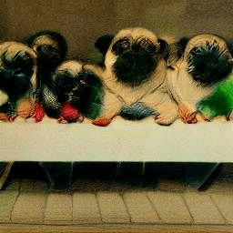
Compare/contrast. The original that inspired my project.
Their light blue is a lot more saturated and cyan-aquamarine; ours is more sky blue. We also went with a more contrasty pair of colors for the flesh tones, with the darker being a lot more red than what the other project used.

Both are beautiful, and I’m very impressed that ours turned out every bit as well as the original. I think we did it justice!

I think their light blue works better for the Air Man and Dr. Wily and Flash Man panels, where it is used for a highlight or two-tone paint job effect; the lighter blue that I went with, I think works better on the reflections on Metal Man’s helmet crest and the reflections on the glass visor on Crash Man and Flash Man’s helmets.
I like the greens that I picked a bit better than what the original quilt used. And I think I like my yellow slightly better as well. We both opted for more reddish colors than are in the NES palette for Quick Man and Metal Man, who are a bit more magenta and purple-y. But despite how the screen capture from the emulator may look, I think that what the two quilts picked for reds are truer to the intent of the game designers and truer to how I remembered and envisioned the characters in my mind.
More than anything, I’m blown away at how well all the colors work together in the image. They were really chosen with great care. I went back and forth with 4-5 and even more candidates, eyeballing them, comparing them to each other and to the reference image that I had on my cell phone, to ensure that everything was as close to perfect as I could find within the limitations of what the fabric stores had in stock. It’s perhaps the easiest to take for granted part of the project, but the color picking was absolutely critical and extremely successful.
I think the color picking and the sewing were equally important in contributing to the end result, and I couldn’t be happier with both.

Looking at the original colors screen-captured from emulation, I think our “wood grain” matches the contrast in the NES, and their light blue is a better match for the NES.
Of course there IS no true color. Every NES displayed on a NTSC (or PAL, in Europe) CRT TV, which used analog signals and the color rendered on every screen was slightly different due to differences in both calibration and manufacturing. So there’s really no “true” color when it comes to NES palette and NES graphics.
What you get in emulation is usually very accurate in terms of how we remember we perceived the color, but of course it’s digital signal, and usually displayed in RGB color on an LED or LCD screen. Very, very similar to what we saw on our TV sets in the 80s. And yet, in reality, quite different.
Finishing The Quilt
With the top and bottom halves assembled, we had all we needed to take on the final level: assembly of the finished quilt with batting and top stitching.
I wanted to use 100% natural wool for the batting, because I think wool is the best fiber. I went with Hobbs Heirloom Premium Wool batting. This was my choice primarily because it was available in the right dimensions to work with my 96×96 quilt without the need to overlap two pieces, but it’s also a well regarded maker.
Melissa wasn’t able to do the top-stitching to complete final assembly, as this requires special equipment that she does not have. Through my local sewing and fabric store, I connected with a quilter who had the necessary gear, a lady named Etta. I met with Etta and discussed the project and showed her the pieces we had assembled, and after looking at different topstitch patterns in her book, I eventually found one that I liked. I left everything with her and waited several weeks for her to complete the work.
I felt it was important to use a stitch pattern that didn’t rely on a grid of right angles that would not be aligned to the grid size of the pixels in the image on the quilt. This was important in order to hide very slight errors in the size of individual pixels due to being stitched together with slight variance in how much of an edge there was at the seams between all the little pixel-sized squares of fabric. So I had initially picked a stitch pattern that used a wobbly, undulating pattern that went back and forth along the length of the entire quilt before doubling back each way.
The next time I heard from Etta, it was her notifying me that my project was the next to go in her production schedule. She had taken a practice run with the stitch pattern that I had selected, and was concerned that it would not work well, because it has a tendency to bunch the fabric in one direction but not in the opposite direction, and this would lead to the finished dimensions compressing one way, making the result a squished square. I looked some more and found another stitch pattern that I thought would work well, and she agreed.
The pattern I ended up going with was an interlocking diamond pattern that I found on a quilting website, mycreativestitches.com.
The final assembly was completed 1/21/2025. Etta sent me a photo of the finished quilt, ready to be picked up. It looks even better than I hoped it would! I am very impressed with the quality of the work that my quilting partners put into this project, and grateful for their contributions. I can’t thank them enough for everything they’ve done. It is spectacular and something that I’m genuinely proud to have had a hand in creating — even if most of the really skilled work wasn’t me.

Delivery Day
1/25/2025.
I just got back from picking up my finished quilt from Etta at Pins and Needles.
This has been in some ways a journey of a lifetime for me. I have always loved blankets. When I was a baby, I was given a blanket that had Winnie The Pooh characters printed on it, which I loved. I was very attached to it through my entire life, and used it all the time, and when it came time for me to go away to college, I intended to take it with me, but my mom, fearing that I would be made fun of, sewed a cover over it. I still have that blanket, but it’s too small to be of much use to me these days, and too delicate, so it’s been put away in a linen closet and is kind of retired. But I still love it, and I think one of the things that is important about me is that the love I have for things that I do love is enduring and ageless. Maybe that baby blanket had something to do with that.
Anyway, Etta was fantastic. She did an amazing job with the final assembly, and even though the store was busier than I had ever seen it, and she was preparing to teach a class at 1pm, she took time to go over everything with me, and was generous with her time and her knowledge, and filled me with the feeling that she understood how important the project was to me, how much I had put into it, and how much of an honor it was for her to take part in that process. She took it out when I showed up at her work station, and unfolded it for me and showed me the results of her work.
She mentioned that this quilt turned out very well, and that it was because of the work that we had done prior to coming to her, which her work serves to show off. Etta’s philosophy is that it’s not about her top stitching, it’s about the fabric and the work done to put the pieces together, and the stitching shouldn’t detract from that or call attention to itself, only enhance the pieces and present them in their best light. Etta is wonderful and worth every penny I paid her, and then some.
She also said that the quilt I brought her tested her limits. Because of its size, and the thickness of the double batting that I had provided to her, it went right up to the limit of what her equipment was capable of handling, and provided a challenge to her skills. She said that just getting the batting to relax and uncrease from being stuffed into its packaging for so long took three days. She had to hang the batting and let it unfurl and relax, and used water spray to get the wrinkles out.
She pointed out a few spots on the quilt that would need a bit of repair, and recommended using a technique called ladder stitch to reinforce a couple of the seams. She said that these spots were due to the sewing bing too close to the edge of the fabric where the seam was sewn. I don’t know the technique but I will study it and learn it and apply it to these repairs and hopefully I will do OK with it, although it is a bit intimidating. I think I will try to practice on some scrap fabric or something until I’m confident that I can do it myself.
Etta had some other advice if I do another project in the future. First, she said she recommended starching the fabric before cutting and sewing. Starching will cause the fabric to act more like paper. It will cut easier, lie flatter, and be less wrinkled, all of which means that cutting and sewing the squares will be easier, and result in more precise, accurate measurements which will be reflected in the final results.
She also recommended using a higher stitch count when working on joining smaller pieces, such as the many 1″x1″ squares that made up the quilt. Smaller stitches should hold these pieces together better, as they kind of loop together and create a stronger chain of thread. She did say that Melissa did a very good job of keeping everything square, which can be really challenging when working with such small pieces of fabric, especially on a piece of such a large finished dimensions. And if it wasn’t for that, there wouldn’t have been much that she could have done to save it. So the results being as good as they are is a testament to the work we put into it, and we should be proud of ourselves. Which, I assured her, we are. For her first time working on any quilting project, Melissa did outstanding.
She also recommended using a darker grey thread than I had picked for the sewing of the fabric pieces; she went with a darker grey for the top stitching, while I had gone with a lighter shade, more of a middle grey, which she thinks stands out in contrast more against the darker colored parts. While her dark stitching does show more on the lighter parts of the fabric, more of the quilt is darker shades, and on the whole you want to pick the thread that will blend in with most of the quilt. Which makes sense.
Etta said that when washing, I could machine wash it, but I should use cold water and dry it by air drying in a dryer, not using heat. Or I can line dry it.
So that’s pretty much the end of the story. The epilogue will be learning to ladder stitch and hunting over both sides of the quilt, looking for spots that need some reinforcement, and stitching them up so that hopefully the quilt will be strong and last many years.
End
It made me SO unbelievably happy to take on the project and work on it. And SO thankful for the help I had in getting to come together.
Every day that I worked on it, every little bit of progress had me vibrating with joy and excitement. I was bouncing.
Yes. It is such a nice thing to have something and care about it and work on it and watch it develop over time and then finally be completed.