Category: reviews

Review: Lenovo ThinkPad P50

Back in March, I took ownership of a new Lenovo ThinkPad P50 laptop to replace my venerable and beloved T61p. I’ve had it almost 6 months now, so it’s been a good amount of time to become acquainted.

History

Originally purchased in 2007, my first T61p served me very well until last January (2015), when the video card failed. I looked at the current ThinkPad lineup, and after rejecting the then-current T and W series Thinkpad models due to their keyboard and trackpads, I promptly went out and bought another T61p from a seller on eBay for around $250, and transferred my SSD to it. Over the years that I owned it, the T61p proved its value, with solid construction, great ergonomics, nice, roomy 1680×1050 screen resolution, and ease of service. Originally delivered with Windows Vista, I installed to WinXP Professional, and later upgraded to Windows 7 when it became available. I replaced a keyboard, upgraded the RAM from 4GB to 8GB, and replaced the HDD once, and then upgraded to an SSD a few years ago, when they got cheap enough. The second T61p had a faster CPU (2.4 GHz Core 2 Duo) and the beefier 256 MB Quadro GPU (up from 128 MB on my first) but was otherwise the same as my original 2.0 GHz workhorse.

The extra CPU speed definitely helped me get through the last year, and other than occasionally running out of memory due to RAM-hungry browsers and running with no swap file, the T61p still feels perfectly viable today as an everyday primary workstation. I’ve only had a few occasions in recent months where, possibly due to Windows 7 cruft, the machine has felt slow — occasionally I’ll get a svchost.exe process that uses up 100% CPU and bogs the system way down, but when that’s not happening, the machine has plenty of horsepower for web browsing, software development, graphic design work, and occasional gaming.

In looking for a replacement machine, my main concerns were not performance, but ergonomics.

I wanted a screen with at least the 1680×1050 resolution that I had come to realize was essential. I like to split the screen down the middle and have two windows open side by side, and 1680-wide gives me enough pixels to do that comfortably, while 1050 of height gives me enough lines of code on the screen that I can spend more time reading or typing, and less time scrolling through my project files.

I also had grown very attached to the T61p keyboard, with its near-perfect layout, and full-size scissor-switch keys, and the touchpad with physical buttons. Later generation ThinkPad machines had done away with physical buttons, changed from scissor switch keys to chiclet keys, and worst of all made senseless and wholly unnecessary changes to the keyboard layout, which I found completely unacceptable.

Even so, after almost 8 years on the same hardware, I did want the replacement laptop to feel like a true upgrade, and to have hardware that could feasibly hold up for as many years as I’d gotten from the mighty T61p.

In late 2015, I strongly considered purchasing a W540-series ThinkPad. I held off after seeing a W540 in person, when I saw that the touchpad itself was a clickable button, and there were no separate mouse buttons. Such a trackpad would be completely useless for precision clicking, and thus would require me to plug a mouse in to do any kind of precise work, which in turn would force me to sit at tables where I could use a mouse, and limit where I could easily do useful work comfortably. This would not do.

But then Lenovo released a minor refresh, the W541S, which brought back the physical buttons, and looked like the best thing I’d seen from Lenovo in years. But this model was a bit lacking — where the full-size W540 could take 32 GB of RAM, the W541S was limited to just 16 GB — which, while adequate, didn’t feel as future proof as I would have liked.

The S in W541S stands for slim, so I inquired with Lenovo customer service and was told a full-size W451 was coming soon, which would have the all-important physical touchpad buttons as well as capacity for 32 GB of RAM. I waited weeks and months, and asked again and was told that I had been misinformed, and that no such model was planned. I kept getting different stories from different reps, and got quite frustrated with not having solid, accurate information.

I briefly looked at the Dell XPS 15, which had fantastic specs — 4K IPS display, up to 32 GB of RAM, but again here I didn’t care for the buttonless touchpad.

Finally, in the second half of 2015 I started hearing about the new P-series ThinkPads, and became very interested in the P70. This system is a monster: up to 64 GB of RAM, 4K IPS display, the latest Intel Core i7 CPU, trackpad with physical buttons, and what looked to be an acceptable keyboard layout, though still not the return to perfection that I’d hoped for. I wasn’t crazy about lugging a 17″ laptop, but then a short time later I learned that they were also planning to offer a 15″ model, the P50. Comparing the specs between the two, it looked as though there really weren’t any compromises between the two, so at that point I was sold.

I waited and waited for the P50 to be released, but it kept being delayed. Eventually, in December they became available. As my second T61p was still going strong, I elected to hold off for a bit and wait to see what the initial reviews said. Then, last week, I received email informing me that Lenovo was having one of their EPP sales, which meant steep discounts. I clicked the link and specced out my dream machine: 3.7 GHz Xeon CPU, 4K IPS screen, 4 GB video card, a jaw-dropping 64 GB of RAM, and 512 GB SSD on a PCIe-NVMe bus, and after almost $1000 in discounts, it came to around $2200, which was well under budget for what I had originally put aside for the more expensive P70.

While that sounds like a lot of money for a laptop, I considered that I’d spent around $1900 for my T61p in 2007, and after using it for almost 8 years, that amortizes away to barely anything — less than $1/day. Considering how much I use the machine (regularly 8+ hours/day), and how productive it has made me, that’s an insanely good value. So when you think about it that way, it’s worth spending a lot of money to get something very good, as opposed to spend less and accept compromises, or have something lower end that won’t last as long whether due to durability or performance.

The Hardware

As purchased:

Battery 6cell 90Wh
System Unit P50 NVQ3 4G E3-1505M v5 vPro
Camera 720p HD 2D Camera Mic
AC Adapter and Power Cord 170W 2pin US
Processor Intel Xeon E3-1505M v5 MB
Color Sensor Color Sensor
Display 15.6 4K IPS Non-Touch
Fingerprint Fingerprint Reader*

*(I didn’t want a fingerprint reader, but there wasn’t an option to remove it.)

Graphic Card NVIDIA Quadro M2000M 4GB
Hard drive 1 512GB SSD PCIe-NVMe
HDD Config SSDx1
HDD Config 2 PCIe SSD
HDD Config 3 512GBSSD PCIe
HDD Total capacity 512GB
Keyboard Language KYB NumPad ENG
Publication Language PUB ENG
Total memory 64GB(16×4) DDR4 2133 SoDIMM (non-ECC)
Pointing device 3+3BCP FPR CS
Preload Language W10P DG W7P64-ENG
Preload OS Win10 Pro64 DG Win7 Pro64
Preload Type Standard Image

*(Windows 7 Professional x64)

Recovery Media W10P64 COUPON WW
Sub Series Variation P50 Quadro Workstation
TPM Setting Hardware dTPM Enabled
Display Panel P50 4K NT 2D MC CS WLWW
Selectable Warranty 1 Year Depot or Carry-in
WiFi wireless LAN adapters Intel 8260AC+BT 2×2 vPro

Price as purchased (incl tax and shipping): $2,271.02

I elected not to go with ECC RAM, which would have added about $450 to the cost, and the P50 doesn’t have a bay for an optical drive, so no DVD option unless I want to plug in an external. I haven’t burned, or even read, a DVD in years, though, so I think optical media is pretty close to obsolete.

Curiously, Lenovo do not offer a Blu-Ray drive option for their laptops that do offer an optical drive bay. The ultra-bay adapter for hot swappable hard drives is a nice option to have, but considering the P50 has an internal bay for a 2.5″ SATA device, and 2 PCIe NVMe slots, it wasn’t worth it to me to go to a P70, for almost $2000 more, just to get a DVD-RW/Ultrabay (although to be fair, that $2000 would have also brought with it 8 GB video card).

Lenovo also just came out with a few more models in the P-series: the P40 Yoga, and P50S. I didn’t consider either of these as I was already eager to buy the P50 that I had selected, but after looking at their specs I have no regrets about picking the P50. The Yoga offers a more flexible screen hinge that allows for using the laptop in different configurations, but with less top-end specs, and the P50S is just a slimmer P50 with slightly less capability, and so I wasn’t really interested in either.

Initial impressions

Pros:

  • 64 GB of RAM! This is 8x the RAM of my old T61p (and 16x the advertised max RAM of the T61p). Knock on wood, but I may never run out of RAM ever again with this machine. 64GB ought to be enough for anybody;-)
  • PCIe NVMe performance. The SSD is very, very fast. I’ve been using SSD for a few years now. The T61p originally came with a 7200rpm hard drive, but I upgraded to SSD after they became available at a price point I was willing to pay. I did notice some performance improvement, but the SATA3 SSD was bottlenecked by the SATA2 interface in the T61p, so I didn’t get the full benefit of the upgrade. By contrast, with the ThinkPad P50, read/write speeds on the PCIe NVMe SSD are amazing. After running Windows Update for the first time on the P50 and installing almost 90 updates, after rebooting the “configuring” that Windows 7 does after upgrades are installed, which normally takes several minutes, were completed in about 20-30 seconds. Waking out of hibernation is nearly instantaneous.
  • 4K IPS is a thing of beauty. The screen is exceptionally clean and sharp, with vibrant color even for an LCD screen. The LED backlight is very even, compared to the florescent tube backlight of older screens. IPS is definitely a much better display technology compared to TFT. I’ve had IPS displays on my desktop, but since I use my laptop much more, I haven’t really been able to appreciate it until now.
  • Speakers are much improved over T61p. One of the complaints I remember from reading reviews of the T61p was that its speakers weren’t very loud even at max volume. I didn’t find this to be a major complaint, and most of the time audio levels were adequate, but I did frequently find it difficult to hear the audio track in multimedia being played on the machine. It just depended on how loud the source was. With the P50, the speakers are much more capable. I don’t need to turn the volume level to 100% just to be able to barely hear audio anymore.

Cons:

  • Trust. The most important con to buying Lenovo these days is trusting them not to pre-install malware and rootkits. Lenovo have been found to do this three times in the last year, which for many is unacceptable. Fortunately, I did not find anything pre-installed on my P50 that I needed to remove. It seems that Lenovo responded to being found out and did the right thing in removing the offending software. It should never have been there to begin with, but at least they had removed it from their newly shipping products by the time I ordered mine.
    • Superfish, the SSL-circumventing private http destroyer, was not found on my machine.
    • I did need to disable “Lenovo Customer Feedback Program 64” using TaskSchedulerView.
    • Lenovo have released BIOS updates that omit the OneKey Optimizer malware that they once preloaded on ThinkPads. I wasn’t able to find information as to whether this was ever included in the BIOS for the P50 model; it’s possible it never was, as this model is more recent than the date Lenovo removed it from machines that had it.
  • Other Software I didn’t want
    • McAfee LiveSafe. I didn’t order this, but I had a subscription to it out of the box. I haven’t ever liked McAffee antivirus, since the late 1990’s I’ve been recommending against it.
    • Microsoft Office. Microsoft are really hard-selling their SaaS Office 365 suite. It was something added to my build list by default, and I had to remove it. I got a reminder at check out asking me if I was sure I really didn’t want it. I debated it for a few minutes, but ultimately I don’t use Office very much anymore, and really prefer Google Docs for most everything, for many reasons. Still, my P50 came with something pre-installed — not sure if it’s Office 365 or 2016. Either way, it’s not getting used, and will be removed. I might install a viewer app so I can handle .doc files that people might send me, or I might install an old license of Office 2007 that is still perfectly fine, but I’m not sure I’ll even need to do that.
    • Windows 10 nagware: This isn’t Lenovo’s fault by any means, but Microsoft is also really hard-selling Windows 10. They want the world to upgrade from Windows 7. I don’t ever plan to. Microsoft’s treatment of user’s private data is completely disrespectful, and unacceptable. And I’m not interested in re-learning how to use and manage the new version. I haven’t ever touched Win8, even. And they keep trying to push Windows Updates on Win7 users which keep trying to push an upgrade to Windows 10. At this point, the only thing that’s keeping me tied to Windows is GameMaker: Studio, and if it weren’t for that I’d be happily running on some Linux distro, most likely Ubuntu. I’m hoping that sometime during the lifetime of this hardware, I’ll be able to make the switch and dump Microsoft for good.
  • 4K resolution problems – TL;DR solution: 2048 x 1152

    It turns out that displaying 4K resolution on a 15.4″ display results in very, very, very tiny fonts. Windows 7 does not handle this well at all. I almost returned the machine for an exchange to a 1920×1080 screen, but after playing with settings for a few days, there are a few workarounds, which I find acceptable, but none of which are perfect:

    1. Set font dpi to 200% or better. The control panel only shows options for 100%, 125%, and 150% at first, but you can set a “custom” dpi using a link at the right. The slider control for this tops out at 200%, but you can override this by typing in the value. I found that 250-300% was about where 12pt text started to get readable to me, but it’s still pretty small, and 10pt and lower is still ridiculously tiny. Unfortunately, this amount of magnification starts to break the containers that Windows puts text into, resulting in an ugly, disjointed Explorer GUI, and probably most applications as well.
    2. Use Windows Classic theme and size the text manually. I created a custom theme for this, so you don’t have to. Download Win7_4K and apply it. I basically doubled the size of all the font settings in the theme. Unfortunately, not everything in Windows uses the Theme settings, particularly older software or software developed by amateurs. But even Windows itself doesn’t make all of its font sizes customizable through this interface, even in Explorer windows there will still be some fonts that are ridiculously small. What terrible design. Microsoft should be embarrassed.
    3. Set display resolution to 2048 x 1152. OK, so native display resolution just doesn’t work well in this size display, at least the way Windows renders its GUI. The only other option is to set display resolution to a lower size. Both 2048×1152 and 1920×1080 look great, and other than not having the full resolution at your disposal, there’s not much of a downside.

Keyboard, mousepad

The basic keyboard layout is acceptable, although I still vastly prefer the T61p’s keyboard for many reasons. Let’s examine those.

The P50 uses chiclet key switches, not the scissor switches used in the T61 keyboard, but that’s acceptable.

I miss the “previous page” and “next page” keys from the T61p keyboard, which weree located at the left and right of the Up Arrow key on the T61p keyboard. On the P50, these have been replaced by Page Up and Page Down, which I definitely use a lot more frequently. As well, an accidental page up/down is less disruptive than an accidental previous/next page keystroke, and so I’ve come to like this change. One problem that I did have with the T61p in retrospect was accidentally hitting the “previous page” key when editing text in a web form, resulting in the browser going back to the previous page, losing everything I’d typed, when I’d simply wanted to move the cursor up a line. This happened fairly frequently, and was a serious annoyance.

I do miss that Page Up and Page Down are no longer in a tight cluster with Home/End. I also find that the cursor navigation keys are a bit harder to find by touch than they were on the T61p, where there they are at corners and edges, which made finding them very easy, even in the dark. On the P50, they’re to the right of the Right Ctrl key, but to the left of the 10key pad. I can find them most easily by going directly below the right Shift key.

A notable omission from the P50’s keyboard is a key for the Context Menu. Normally this is thought of as the “right-click” menu, but there’s a dedicated key on most keyboards for this as well, which is known as the Appskey. A workaround, to re-map the right-alt key to Appskey exists, using a free application called AutoHotKey. However, a downside of this is that Alt+PrintScreen is a very commonly used keystroke in my work, and if I re-map the right-alt key (which is right next to the print screen key on the P50) I sacrifice being able to do quick, easy print screen to copy buffer for the current window. But I also use the Appskey very frequently in my work as well. So I can instead re-map right-Ctrl to the Appskey, and do without a right-Ctrl key. None of these arrangements is truly ideal; they’re all compromises. My advice is to try it and see which arrangement you prefer.

The 10-key pad on the right side shifts the main keyboard left of center of the screen, which makes it a bit less comfortable to use, and the navigational keys aren’t as easy to find without taking my eyes off the screen to look for them. If I turn off numlock, though, it turns the 10-keys into Home, End, and arrow keys, which I like. I leave numlock off most of the time, unless I’m actually keying in a lot of numbers, and then I find it handy.

However, a huge negative with this keyboard is its rollover. If N-key rollover isn’t possible for technical reasons, I feel that at this price point a minimum of 6KRO should be expected. I can’t play games that use the keyboard for controls, because after just 2 buttons held down, a third key press is not reliably detected and reported to the OS. As a gamer and game developer, this matters, and is a huge, huge disappointment. If I gave laptop reviews a star rating, I’d penalize the P50 an entire star just for this issue. Maybe two stars. The built-in keyboard is that important to me.

The mousepad is off-center from the screen, but centered under the spacebar. It’s large enough that my palms will accidentally bump it occasionally, and this can be annoying, but it’s not a severe problem. I think I would like a slightly smaller mousepad, all the same.

The return of the physical buttons (three of them!) above and below the mousepad is what I like the most. It’s great to have physical buttons back in this generation of Thinkpad. The lack of them was why I refused to buy a W540 last year, when I first considered replacing the T61p.

If the machine didn’t have a 10key pad, and the layout was more like the T61p keyboard overall, and it had NKRO, I’d be completely in love. As it is, the keyboard is mostly decent, other than that it completely sucks for gaming.

BIOS tweaks

Looking in the UEFI BIOS, there’s a couple of nice configurable settings. Foremost, Lenovo have enabled the user to decide to switch the Fn and left Ctrl key. This was a popular 3rd party hack for the T61p BIOS, but I never bothered with it because I didn’t want to risk running an unofficial BIOS. Now that it’s an officially supported option, I’m happy to have Ctrl in the standard location where it belongs, even if the keycaps aren’t identically shaped so I can’t switch them physically.

Also, there’s a BIOS setting to change the top row of keys from being special functions or F-keys. By default, if you press the top row keys, they’ll do things like adjust volume or dim the screen. If you’re used to using the F-keys for shortcuts, Alt+F4 closes windows, and F5 is browser refresh — I use that all the time. For me, it’s essential to switch this in BIOS. I could also do it by hitting Fn+Esc, which sets the Function lock on, but then the Fn lock LED is lit all the time, and I’d rather not have it lit all the time, just to save what little bit of battery drain it might use if for no other reason.

I didn’t find a default Numlock state setting in the BIOS, but I’d like the numlock to be disabled, so I can use the 10-key pad for its alternative function of navigating by cursor. Keeping the 10-key pad in this mode makes the keyboard layout slightly less annoying, since Home, End, Page Up, and Page Down, and another set of Arrow keys are all available through the 10-key keys. It’s just a single keystroke to toggle the numlock, but it’d be nice if it was always off after a reboot. Fortunately I don’t need to deal with this much, as I don’t reboot very often.

Warranty Service

In August, I had to send my P50 back to Lenovo for warranty service, after a column of pixels got stuck on.

P50 4K IPS screen with a column of stuck pixels

At 5 months, a column of pixels got stuck “on”. Lenovo fixed the issue under warranty, and the machine was out of my hands for a little over 48 hours. Very impressed.

Overall the experience was great, but contacting the right folks at Lenovo and getting a clear connection was not as easy as it should have been. After a few attempts I finally got a hold of the right department, they asked me some rudimentary troubleshooting questions, and once they understood the problem I was describing, they issued me a support ticket number and explained the process for the warranty repair.

The next day, a return shipping box was at my door. I removed my SSD, not wanting to risk my data being lost or falling into the wrong hands. Lenovo considers the SSD to be a “Customer Replaceable Unit” so there was no problem for me to do this, and it did not void my warranty. With the SSD removed, I packaged the laptop up and shipped it on a Wednesday, and it was returned to me Friday morning. This made me very happy.

Considering they had told me to expect it to be gone 7 days, I was very happy with the turnaround time. I don’t know what the problem was with the screen, but I suspect that it may have just been that the video cable needed to be reseated. They did not replace the screen (the tape I had put over the webcam was still there when I got it back), but the problem is gone.

Overall Recommendation

This is a very high end midsize laptop with a ton of value and great features. Performance is outstanding, and the warranty support is even better. It’s pricey compared to lower end machines, but if you need a high end laptop, this is a very good one.

If it lasts me as long as my T61p did, it will have been well worth it. My T61p lasted me an incredible 8 years, and while I don’t think anyone expects that from a laptop (most are replaced in 2-4 years, typically) if I get 7 years out of the P50, that works out to less than a dollar per day. When you think about it that way, suddenly spending over $2.2k on a laptop seems very reasonable.

My only complaint with it is the keyboard. The keyboard is very good compared to most current laptops, but unfortunately it has terrible key rollover characteristics that make it a dud as a gaming machine. The keyboard layout may not be everything I wanted, but considering what we saw Lenovo putting on ThinkPads between the T6x generation and now, it’s nearly a return to their old form, and close enough to what I wanted that I can live with it, although I absolutely want Lenovo to deliver an NKRO keyboard with their next hardware revision.

Some users might feel that the lack of an optical drive/ultrabay is a disadvantage, and to them I would point them toward the ThinkPad P70.

The Dell XPS 13 and XPS 15 are also worth looking at in this performance class. But I think the P50 likely edges them out in most respects, but especially on the mousepad and keyboard. If you would prefer to avoid Lenovo for now due to the trust issues mentioned above, or other reasons, they might be more for you.

I haven’t tried out Linux on this machine yet, so I have no remarks as to it’s compatibility and stability with a Linux distro running on it.

Appreciating MegaMania

Megamania, published in 1982 by Activision for the Atari VCS and designed and programmed by Steve Cartwright, is one of the all time great video games, and is a standout on the Atari 2600 console and in the vertical fixed shooter genre. Inspired by the Sega arcade game Astro Blaster, but vastly better, it is an extremely well refined shooter for its time, and is a fun and challenging game to this day.

Above: Astro Blaster, an 1981 arcade game by Sega that bears some resemblance to Activision’s 1982 hit on the Atari VCS, Megamania.

Astro Blaster had many features, including digitized speech, that made it technically impressive for its day, but the design did not integrate the features particularly well, making the game overly complicated and clunky. By comparison, Megamania offers a stripped down, almost poetic experience, with elegant symmetry and proportions. Far from a ripoff of an original game, if anything it’s a refinement. Megamania expresses its beauty through minimalism and an elegant orderliness to its structure. This game is all about action and motion, and the original version just gets these things right. There is a rhythm to the game that a good player will develop a feel for, and learn to use to his advantage.

A major hit for Activision on the 2600, Megamania was later ported to the Atari 5200, and Atari 8-bit computer line, but the original remains the best play experience despite modest graphical improvements in the later releases. I’ll be discussing the original VCS version of the game for the rest of this article.

Here’s how Megamania looked on the Atari 2600:

Due to the hardware limitations of the 2600, the player is permitted only one shot on the screen at a time. The player can steer the shot with their ship as it travels upward, giving them the ability to guide their missile into the target. Somehow, despite their varied and erratic motion, the enemies often seem to line up just right so that if you’re in the right position and have the right timing, your next shot will rapidly find your next target, enabling you to clear the wave quickly and resulting in great satisfaction. But if you’re off target, the same proportions of speed and distance that line up your shots on target will cause you to miss frustratingly. It’s an elegant symmetry that provides both challenge (when the player’s timing is off) and reward (when it is on) with the same few, simple mathematical relationships, giving the game a subtle beauty.

The object in Megamania is to survive wave after wave of zany household objects that come at you from the top of the screen, as you shoot up at them for points. Your ship has an energy meter that slowly winds down, providing a time limit to complete the wave; when you complete a wave, your remaining energy meter is converted to bonus points, then refills, and the next wave begins. The waves repeat in cycles, in the following order: Hamburgers, Cookies, Bugs, Radial Tires, Diamonds, Steam Irons, Bow Ties, and Dice.

megamania enemies

There are two variations in the play mechanics, having to do with the way your shots behave:

  • In variation 1, the ship will fire continuously as long as the fire button is held down, and the shots are steerable, moving in line with the player as the player moves. This generates the rhythm that makes the game so fun, as I will show with some detailed explanation to follow.
  • In variation 2, the player must press the fire button each time to fire a shot, and the shot moves vertically only; once it leaves the gun it cannot be guided by the player.

Variation 2 requires more hand-eye coordination and greater attention from the player, and is therefore much more challenging, but I find that the feel of the game is not nearly as immersive as when you are able to steer your shots. In variation one, you feel at one with both your ship and its missile, and while you steer your shots to hit your target, you must simultaneously dodge to keep your ship safe. This creates an inherent conflict that causes the player to constantly be making decisions at a subconscious level. In variation 2, once your shot is launched, you have no further influence over it, and can only watch until it hits something or leaves the screen, leaving you only to avoid enemies and their fire until you can fire again yourself. And since there is no auto-fire in variation 2, the subtly clever timing that results from the relationship between the distance and position of the enemies, their speed, and the speed of your missile, is lost.

The sound effects, while rudimentary, are strong, and fill the game with noise from start to finish, despite being limited to your laser shot, enemy destruction, the energy meter countdown and refresh, and player death. The enemies, rather than explode, disappear with a brassy, synthesized “clang!” , while you fizzle away into nothingness when you are hit by a missile or collide with an enemy. The effects are blaring, loud and harsh, but with the volume turned down low they serve well.

The wave cycle in Megamania is particularly well paced, with a fantastic challenge curve, and a structure that reminds me of a sonnet or a fugue. Certain waves (metaphorically) “rhyme” with others, being similar in their motion patterns. Patterns established in earlier waves are elaborated upon in subsequent “rhyming” waves.

The odd-numbered waves (Hamburgers, Bugs, Diamonds, and Bow Ties) all move horizontally from left to right across the screen. In the first cycle, their motion is constant, while in the second and subsequent waves, their motion pauses periodically for a few seconds, then suddenly accelerates before settling down to normal, and then repeats. Starting with the Bugs wave, the horizontal scrolling waves add a vertical undulation to their motion, which becomes more pronounced with Diamonds and Bow Ties. Diamonds and Bow Ties “rhyme” further with each other by having a “winking” or “spinning” appearance. These are the easiest waves to clear, as the enemies pose no collision risk to the player, who can only be destroyed by enemy shots or running out of energy in these levels. As the first, third, fifth, and seventh levels in the wave cycle, they provide a breather between the more challenging waves. Each odd-numbered wave may be seen as an elaboration of the previous in the series: Hamburgers move horizontally; bugs move horizontally, and with a slight undulating vertical dip; diamonds move horizontally, have a more pronounced dip, and spin; and bow ties move horizontally, have the most dramatic undulation, and spin.

The even numbered waves all feature objects that pass vertically through the screen.

Wave 2, cookies, introduces the player to vertical motion gradually, as the cookies move primarily horizontally, while doing a two-step drop periodically, and reverse their horizontal motion as well. Cookies move in unison, all moving left or all moving right at the same time. Wave 4, radial tires, kinetically “rhymes” with cookies, but the radial tires dip more quickly, and the wave introduces a more complex motion where alternating rows of tires move left or right simultaneously. These levels are particularly dangerous, as in later cycles they descend increasingly rapidly, but a skilled player will learn, after the panic subsides, to make small, economical moves, and let the shots line up and rapidly take out strings of enemies quickly. At this point the levels remain challenging, but reliably beatable by a skilled player. You’ll die quickly if you get out of rhythm and fail to clear out enough enemies to give you adequate space to dodge, or if the computer gets lucky with one of its shots, but if you’re on your toes and in the zone you should be able to clear these waves with only an occasional death.

The next two even-numbered waves are of special difficulty, although their unique patterns do not “rhyme” with each other.

Wave 6, Steam Irons, uses a deceptive and tricky pattern. Three columns of steam irons descend, pausing and then sweeping irregularly from side to size at a speed that is very difficult for the player to track, as they seem to deftly weave right around your shots, and then descend again. The spacing of the formation is such that the player must shoot out at least one from each column, or else that column becomes an unbreakable chain when the column reaches bottom and wraps around to the top again, providing insufficient space between the rows to allow the player to squeeze in and get a shot off. If the player fails to take out at least one steam iron from each column, it is guaranteed that he will die at least once before completing the wave. The interesting thing about wave six is that it is the one wave in the entire game where the behavior pattern never varies, no matter how many times the player cycles through the game, the steam irons always move the same. Despite the lack of increasing challenge, the behavior is so frustrating and erratic that players often ascribe a sinister artificial intelligence to the steam irons. They are a constant threat to the player, no matter their skill level.

Wave 8, Dice, are special in that they are the only wave that is always the same color, yellow, no matter how many cycles the player completes. Dice are also unique in that they are the only objects that do not fire any shots at the player, and are therefore dangerous only due to collisions. Yet this is more than enough to make dice the most challenging wave to survive. The first dice wave is also the only level in the game where the objects move straight down. While their speed in the first cycle may seem overwhelming, their simple vertical motion makes it a fairly safe level. Simply stand your ground beneath a falling pair of dice and shoot, and your shot will surely find its mark, protecting you. But in the second and subsequent cycles, the dice move horizontally as well, in rows that alternate left and right, and create an almost bullet hell-ish level where dodging takes a great deal of finesse. The player has to move constantly on the dice levels to avoid fatal collisions, making it the most strenuous and challenging level, a climactic finish to the wave cycle. A skilled player can still beat the level without getting hit, but it requires great concentration and timing.

If we think of the eight waves that make up the wave cycle as a stanza in a poem, then the “rhyme scheme” suggested by the structure of the eight waves is as follows: A, B, A, B, A, C, A, D. The difficulty curve of a cycle is interesting, in that it does not simply progress in a linear fashion, but instead plots two different curves: the odd-numbered waves follow a more linear progression, while the even-numbered waves follow a steeper progression. This gives the challenge curve a continually escalating trend line while still affording the player a “breather” between two more difficult levels.

megamania difficulty curve

After three or four cycles, the difficulty does not ramp up further, and the game turns into an endurance match to see how many cycles the player can endure. If you can make it to 999,999 points, the game ends, effectively a killscreen.

One of the more interesting things to realize about the mechanics of Megamania is that (with the exception of the first Dice wave) the horizontal speed of all the enemies in the game matches the player’s horizontal speed. After the first cycle in the odd-numbered waves when the enemies accelerate to double time. The rest of the time, the horizontal speed of the enemy objects always matches the player’s horizontal speed exactly. This, combined with the shot-steering in variation 1 makes tracking the enemy objects easier, since you, your shot, and the enemy all move at the same speed, it is trivial to line up and guide the shot into the enemy on the odd-numbered waves. It also means that if you are behind an enemy, there is no way to catch up. Interestingly, players often don’t realize this, and novices and even moderately experienced players will persist in trying, to no avail, to catch up with an enemy that is just past the reach of their fire. Once you realize that it is impossible to catch up, and stop chasing, the player gains an insight that will lead them to higher skill levels — it is very common for a player chasing an enemy that they cannot possibly hit to accidentally run into an enemy missile, or run out of room at the edge of the screen and get pinned. But once you learn to avoid these two common causes of death, you become better at dodging, and the game opens up and becomes easier.

Another important realization is that the positioning of the enemies often is such that when you connect with a shot to destroy one, your very next shot will also connect with another enemy if you don’t move. It’s very common to chain together “string” of two, three or even more hits in a row, in very rapid sequence. This is key to success, and especially critical on the later cycles on the even-numbered waves, where the falling enemies present a collision danger, and taking a chain of them out immediately when the wave begins is crucial to carving out enough space to enable you to dodge and survive. When you realize this, the game becomes less about chasing aggressively and aiming, and more about being in the right position, and letting the enemies come to you. This is where the auto fire feature of variation 1 comes in to play, as once you have connected with a target, you are likely to hit again with your very next shot, and may start a chain of hits just by holding position and keeping the fire button pressed.

A final note of strategy helps with avoiding being shot by enemy missiles. Only two enemy missiles are capable being on the screen at any given point in time. What’s more, there are only two enemies at any given time who are capable of firing. If you see an enemy shooting bullets, you should avoid it and concentrate on eliminating the enemies that are not shooting, as they are less of a thread and easier to safely destroy. Don’t go under them when they stop moving, and wait for them to move again before tracking them. Then, take out the shooting enemies when they are moving, by matching pace with them. Enemy shots do not steer, so if you move in sync directly below a horizontally-moving enemy that enemy cannot hit you, and you cannot miss them. The most dangerous time in the odd-numbered stages is when are moving against their motion, from right to left, since this is the only time when you are likely to hit an enemy missiles.

Wrapping a formation of enemies

Another point of refinement that I find interesting is in the way the enemy objects wrap around the edge of the screen. Enemies in Megamania move together in large formations, but the way they wrap around the edge of the screen is interesting.

What I find innovative in this is that it doesn’t matter how large the formation is — looking at the odd-numbered waves, if you don’t shoot any of the enemies, they will form an unbroken chain as the first to appear wrap immediately behind the last. If you shoot a few, leaving holes in the formation, the holes persist and are not closed up — except if you shrink the formation at the leading or trailing edge. When that happens, the formation wraps sooner, closing the gap between the last still-extant enemy in the formation and the first. Thus, when the last Hamburger, Bug, Diamond, or Bow Tie is left in the wave, when it reaches the right edge of the screen, it wraps immediately to the left, rather than waiting for the space taken up by the no-longer-existing members of its formation. This is important because it avoids wasting the player’s time, as the energy meter winds down while no enemies are visible on the screen.

The tight, precise nature of the motion of the enemies makes Megamania a satisfying and exciting play experience, and feels complete despite a relatively small feature set. Megamania demonstrate that refinement and polish matter far more than feature count.

NES enters the HDTV era

Old school console gamers appear to be on the cusp of a renaissance as new options for bringing the NES to modern TV in glorious high definition resolutions keep coming out.

I haven’t seen any of these in person, and only one of them is available now, but here’s my impression based on what’s been published about them so far:

AVS by RetroUSB

$185. Pre-order now, shipping mid-Sept 2016.

On paper this looks to be the best of the bunch. This is a real-hardware console, incorporating a NES and a Famicom cartridge slot, built-in 4Score (4 controller ports), power supplied by USB cable, and does HDMI output in 720p. This is pretty much everything you’d want in a NES, all in one package.

It remains to be seen whether RetroUSB will deliver on time, and what the quality of the hardware will be, but this could be the way to go if quality is good. They are an established company and have been producing controllers, adapters, and homebrew carts for NES and other old school consoles for years, so they do have a track record of doing quality work.

Hi-Def NES by game-tech.us

$120+ depending on options. Shipping now.

This is a DIY kit (professional installations available through various 3rd parties for around $85) for original NES (both the front and top loader). You do surgery on your NES and add a daughterboard that gives you HDMI-out.

Designed and engineered by well-known console hacker Kevtris, the Hi-Def NES appears to be a very well done mod, yielding a high quality 1080p image without the lag associated with running a NES through upscalers, and provides many options in firmware to tweak the output to taste, including aspect ratio, scan line, and interlacing adjustments, to ensure you can get your picture just right.

The mod is fairly involved to install, so paying a professional to do it right is probably worthwhile, but going this route makes it a little more expensive than the AVS. As well, the mod doesn’t do anything about adapting Famicom games to play on it, although you can just get an adapter or run Famicom and PAL games through a flashcart, and if you’re a serious enough retro gamer to go for this mod, these are probably already in your arsenal.

Best of all, it’s available now. Game-tech does other mods and repairs of old consoles, although right now they’re focusing exclusively on selling Hi-Def NES, and from watching their youtube channel it’s apparent that they know what they’re doing, have a lot of experience, and really care about old school gaming.

NES Classic by Nintendo

$59.99. Available 11/11/16.

This is an official Nintendo product. It comes preloaded with 30 titles, all of which are worthwhile games, but does not have a cartridge slot, and does not have a way to connect to the internet to download any other games, which are serious downsides for many. It does have HDMI output, and allows you to save your games, which is a new feature unavailable from the original hardware.

It’s considerably cheaper than either the AVS and Hi-Def NES modkit, making it an attractive option to gamers who have never owned a NES and don’t already have a library of cartridges to play. Given the cost in the collector’s market of the top titles on NES in their original format , acquiring such a catalog today starting from nothing would be a very expensive prospect compared to just buying this.

While I don’t expect that this option will hold as much appeal for gamers who still have their collections, it should have some appeal to a broader market.

GameMaker: Marketplace vs. itch.io: comparison

After two years of selling assets on the GameMaker: Marketplace, still in public beta after all this time, I am less than impressed with the experience.

Development of the marketplace website, as well as the integrated features in the GameMaker: Studio IDE, have not been forthcoming. Initially the news of the Marketplace excited me, and it seemed that the future of GameMaker was bright and full of promise. But two years later and almost nothing has changed with the way the Marketplace works — and it works poorly, I’m afraid.

Plagued by a terrible bug which causes the IDE’s My Library interface to become unbearably slow to load when a large number of assets are purchased from the marketplace, sales have ground to a halt. Worse, it seems that no one is interested in spending any money in the Marketplace.

In over two years of selling assets at the Marketplace, I have grossed just slightly over $100 in sales, lifetime, of which YYG take a 30% cut, leaving me well under the $100 minimum in order for them to release any proceeds to my account. I’m currently seeing “sales” of my free assets at a rate of 2-5/day, and maybe once a month or so I’ll see a sale of one of my paid assets.

I’m not advertising aggressively, and there are certainly marketplace sellers who are doing better than I am, with more impresive wares than I’ve produced, but I don’t think that quality doesn’t seem to be the problem; I have a number of free assets, and they’ve done comparatively well, with several hundred downloads to date each. The paid assets, on the other hand, have sold in the single or low double digits.

GameMaker has had a long history of being an inexpensive software intended for use primarily by students, and these users as well as hobbyists have howled over the price increases to the main product; even when GM8.x went from $25 to $40, there was much complaining. The lesson seems to be, “Don’t expect to ever make any money from such tightwads.”

Mind you, I don’t think I’m entitled to sales, but it is certainly frustrating to put effort into something for such meager reward, and it’s demoralizing to see how little effort YYG have put into improving the Markteplace experience since they went public with it.

Although YoYo Games have tried to transition into a more professional tool by adding numerous features over the past 6 years, it seems that lately development has stagnated. No one really knows when the long-awaited, so-called “GM:Next” (aka 2.0, currently in non-public beta) will be out. No one’s really talking about what’s going on behind the scenes, and with their roadmap no longer available, it’s been extremely frustrating to wait for months and months with only the occasional minor bugfix patches for 1.4 being released.

I finally decided to check out alternative marketplaces, and have been very favorably impressed with itch.io. Itch.io is easy to sign up for and use, and much more flexible than the YoYo Marketplace. The only downside being that you can’t integrate itch.io assets with My Library (although, with it’s current buggy and awful performance, it’s not much of a loss) but at least My Library notifies you when updates are available for assets you own.

Itch.io allows me to set prices to whatever I want, or whatever the buyer wants, create bundles of assets for sales, and schedule these sales to start and end at defined times. None of these features are to be found in the YoYo Marketplace. Itch.io seems to be more for finished games, but there are also assets for game developers, and other types of things for sale, such as digital books and music. Best of all, itch.io only takes 10% of your gross sales (and they allow you to change that figure if you wish). The diversity of the itch.io store means of course that only a fraction of shoppers there will have any interest in GameMaker extensions, which may prove to be a downside. As well, their store is populated by thousands of great games and other high quality goods, many of them offered for free, so while the barrier to entry is technically low, the expectations of the customers of this marketplace may be high.

Itch.io’s analytics also provide me with better information than YYG. With YoYoGames, they consider you, the publisher, to be a “third party” to sales through their store, and therefore they do not share your customer’s personally identifiable information with you, so you can’t contact your customers. Itch provides the email address, so you can engage your customers, for example notifying them when an update is released, or when a new product is available.

In all, they’re basically eating YoYoGames’ lunch in terms of e-commerce user experience, both as a publisher/seller and as a customer. YYG really need to get it together and catch up with the competition, and soon.

Game review: A Dark Room

One of my readers recently contacted me to ask for some advice, and in the course of talking to them, they turned me on to A Dark Room, which is the first rogue-like game that I’ve really liked. (“Rogue-like” is a pretty broad and flexible term, and I’ve played a lot of games before that use a permadeath mechanic, procedurally-generated maps, and ASCII graphics, but despite recognizing that the genre is significant and influential, I’ve never found roguelikes to be my cup of tea.)

It takes a little time to get going, but once you get a glimpse of what’s going on, the game opens up and gives you more new stuff to explore and figure out, and this creates a compelling obsession to continue playing. Fortunately, it’s not a huge game, and has an ending, which I discovered a little before 4AM last night, or else I might still be playing it. You can beat the game in a single evening long playing session, so I wouldn’t call it a long game, but it took a few days for me to figure out all the things that I needed to know in order to get to that point.

There’s so much this game does right that I want to take some time to analyze its design in order to explain why it succeeds so well.

At first, the game is simple. There’s not much going on, and not much to do. You start out with nothing, and after a few clicks and reading some sparse narration, you’re introduced to a new mechanic, and begin building a village in the wilderness. There’s no graphics, just text, and all you do is develop an economy based on gathering wood and trapping for meat and fur. Despite this portion of the game consisting mainly of watching progress bars count down and various resources (hopefully go up, this part of the game had an addictive quality for me; I couldn’t stop myself from building and taking care of my villagers! If I did, the game would make something bad happen to them, and if I tended to them, they flourished. It kept me paying tight attention to ensure that they were safe, that the village was growing, and my stores of resources were increasing.

And then, just when I was starting to wonder if this was all the game had to offer, it opened up yet again, and revealed that I could leave the relative safety of the village and explore a larger world. Suddenly, all the resources my village had been producing had a purpose: to outfit me so I could go explore and adventure. I went out and died a bunch of times, which set me back, but not terribly, and eventually I figured out how to survive most encounters, although if I strayed too far from home, I would encounter enemies I couldn’t defeat, or would run out of food or water.

The overworld map is graphical, but it is rendered in ASCII, but unlike a lot of other ASCII graphic games I found it intuitive and easy to read. Various types of passable terrain are rendered in a light grey text, while points of interest are rendered in black, which helps considerably. You’re a rogue-standard @ symbol, which is easy to remember because that’s where you’re “at”. Other points of interest are represented by easy to remember symbols: V is a caVe, O is a suburb (Outskirts of a larger citY? Y = city.) H is a house, and so on. As you play you are introduced to these symbols gradually, so they are not difficult to learn, and reading the map is easy and intuitive after a short learning curve.

It took me a few excursions to figure out how to survive and make it back t my home villAge. So at first I didn’t realize that by prevailing in a string of encounters, you could clear out a caVe or Outskirts or citY, and turn it into a Pacified wayPoint where you can heal and resupply. Creating a waypoint also creates a path where you can travel safely — you won’t encounter random enemies on a path, and walking on the path consumes less water and food, which allows you to go further.

I also figured out that I could clear out mines and start mining new types of resources, which took me back to the village to juggle my economy and craft more new gear, so I could go out and adventure a bit less fearfully. It was a pleasing cycle. Once I discovered the secret of steelworking, I got to a point where I was pretty confident that I could survive in the wilds, so long as I was cautious and kept a close eye on my vital stats. I found a few more types of resource, which seemed mysterious, and made me wonder what else was out there to be discovered.

Eventually, I made a discovery that put me into the endgame. I won’t spoil it for you, but at that point I felt like I’d accomplished my purpose, and was able to put the game down.

Along the way, I created this spreadsheet to help me plan the village economics and make sure I wasn’t running a deficit on any of the vital resources I needed to make progress and survive. I’ll be direct and say that at least 90% of the enjoyment you will get from the game is through figuring this out on your own, but keeping notes to stay organized once the village economy gets to a certain size and complexity is, perhaps not quite a must, but definitely very helpful. I haven’t given it all away, there’s still a few secrets waiting to be discovered. But if you want spoilers on how to manage your village, the spreadsheet will get you through that phase of the game handily.

A Dark Room Wiki is a guide dedicated to the game, but I didn’t discover it until after I’d beaten the game. It’s also available as a mobile app game on iOS and Android.

Classic videogame storage

If you’re a classic game collector, videogame storage is a constant challenge. After hunting for the better part of a year, I have found that Sterilite 32-quart/30L “Clear View Latch” containers are just about perfect for my needs. Measuring 23 5/8″ L x 16 3/8″ W x 6 1/2″ H, they seem to be an ideal size for Atari 2600/Colecovision/Intellivision and NES cartridges. I highly recommend these, and I hope that Sterilite won’t discontinue them any time soon. I bought several at Target recently for $6.29 each.

Product label for Sterilite 32-quart Clear View Latch container

It’s also a good size for carrying and moving — they are not too heavy when fully loaded, are sturdy enough not to bend when lifted, and the lid latches securely to the bin. The walls and corners are somewhat rounded, which is necessary for strength and rigidity with this type of plastic, but are straight enough that you don’t end up with a lot of wasted space or weird humps that prevent the games from lining up nicely into rows and columns.

One of the annoying problems of storing Atari 2600 games is the odd sizes certain third parties packaged their games in. M-network, Parker Bros., Imagic, and others, used non-standard sizes which will mess up any specialized solution that uses slots. This container is tall enough that this is not a problem for all but the “double ender” carts that are two games in one, elongated shell. This is great for me, because it means that I can finally store almost all of my games in alphabetical order by Title, without compromising by storing the oddball cartridges in another container.

About 80 NES games fit neatly in one bin.

NES games in four rows of twenty fit neatly in the bin

And about 102 Atari 2600/7800/Colecovision/Intellivision sized cartridges.
Atari games in 6 rows of 17, for a total of 102, fit efficiently in the bin

I need to buy more to box up the rest of my collection, but when I do I’ll post some more photos showing how they do with Atari 5200, SNES, and N64-sized cartridges.

GameMaker: Exodus

I’ve been doing game dev programming in GameMaker since 2010, and lately I’ve been feeling rather frustrated by the pace with which they’ve been improving the tool. Since being bought by PlayTech in February 2015, YoYoGames seem to have hit a brick wall.

Languishing, poor quality betas of (potentially) exciting new features

The GameMaker Marketplace debuted almost two years ago. Today, it is still in Beta. Much worse than that, there has not been any substantial development in the Marketplace website, or the integration with the GM:S IDE, in about the last year-plus.

There’s been a long-standing bug with their marketplace integration, when you have purchased a “large” number of assets from the Marketplace, the interface for managing them bogs down and becomes nearly unusable. I reported this defect, a year ago, and YoYo have acknowledged the problem, but done nothing to address it in a meaningful way, other than to warn users not to buy too many marketplace assets. That’s right: YoYoGames built a store for its users to sell assets they’ve made to each other, and then told them not to buy too many assets.

The interface for My Library is terrible — very basic, and lacking in features to allow you to organize the assets you’ve purchased. The performance problem especially is infuriating, and makes the My Library feature basically useless. I offered some ideas for improving the My Library interface on the GMC Suggestions sub-forum, which is now unavailable — apparently YYG have done more in “archiving” the old forums than simply setting them to readonly. [Internet Archive snapshot of the forum thread.]

YoYo acknowledged the problem, but rather than fixing the performance problem, they recommend a workaround of disabling assets from your purchase manifest, until the number of purchased assets is at a number that GM:S can manage without choking. That is, YoYo recommend that you disable assets that you’ve purchased through the Marketplace store, until you’ve disabled however many assets you may need to get below a number that their terrible interface can manage. We’re talking modern computers with billions of bytes of memory and multi-core gigahertz processors, choking on a list of perhaps 75-125 assets. It’s an embarrassment, and the worst part of it is that it discourages users from purchasing more assets from the marketplace, or using them.

None of this has stopped YYG from taking 30% of sellers’ revenue from Marketplace sales. In many cases, sellers are building assets which provide features and functionality that YYG should have developed themselves. For example, GameMaker 8.x used to have something called Room Transitions, which gave a neat visual transition when switching between one room and other. These were implemented in a way that took advantage of native Windows system calls, and couldn’t be supported on other build targets easily, so rather than re-implementing them in a cross-platform way so that all build platforms could make use of them, the room transition functions were deprecated and removed from GM:S.

Developers were told to write their own room transition code, and not expect the built-in transitions to return in any future updates. A few enterprising GM:S users have done so, and now sell room transitions asset packs through the Marketplace. The result of this is that a feature once included in GM:S now a separate add-on that you have to pay for. Except YYG don’t have to pay the developer anything for the work, and instead take a 30% cut of the developer’s income. This makes the Marketplace a very cheap way to outsource development that should be happening in the core product, not as aftermarket add-ons.

Of course there’s also a lot of assets for sale in the Marketplace that are free, and/or do things that are useful but should not be core engine features. The Marketplace was a great idea, and has a lot of promise, but has languished since the PlayTech acquisition.

Hamstrung by legacy cruft

YYG have been stuck with an old, crufty codebase written in Delphi C for the main IDE, and haven’t gotten off of it in 4 years. They always blame the old codebase for why they can’t deliver new features to the IDE, and promise to consider ideas for new features in “GM: Next”. They had made excellent progress in the first 2-3 years, focusing first on improving the performance of games built with GameMaker by introducing the YoYo compiler and runtime, porting those to modern C++, and incorporating exciting new features like Box2D Physics and Shaders into the old IDE. But since then, we haven’t seen much. GM:S 1.4 was released in late 2014. The PlayTech acquisition was announced a few months later in early 2015. Before the acquisition, we had a major update about once a year: Since the acquisition, YoYo have only released minor bugfix updates to 1.4. The biggest missing deliverable by far is the replacement of the old IDE with something modern and coded in a more maintainable way. The old Delphi codebase has left them hobbled, unable to deliver new features, and having to work harder than they should have to to add simple enhancements and fix bugs in the old.

In the meantime, a third-party IDE for GameMaker has been offered by at least two different groups. Parakeet and Enigma are the effort of frustrated GameMaker users who got sick of waiting for an official rewrite of the GM:S IDE, and took matters into their own hands and built their own. While it’s good to have alternatives, these are precariously positioned as GameMaker is closed source and any third party efforts such as these are prone to breaking if YYG change the way GameMaker works.

Promises undelivered and unfulfilled

“GM: Next” feels more and more like vaporware as time goes on. There’s no timetable for its release any longer; YYG have actually withdrawn their old roadmap that charted out their plans for the future so you could know what features might be coming and when.

The last straw has been this failure of the migration from the old GameMaker Community Forum software to a replacement running something with better security and features. They put the old forums in readonly mode in early April and promised the new forum in a couple weeks, which was itself a pretty headdesk move on their part, since there’s no reason why there should have been any downtime — archive the old forum only once the new forum is up and running, ready to launch.

But, almost 2 months later, they still have yet to deliver the promised replacement forum. Inexcusably, they’ve been all but silent on the matter. No apology for taking so long, no explanation of why it’s been taking way longer than expected, no revised ETA on the new forums. I’ve seen one tweet from a YYG source saying that they don’t know when it will happen, and they’re sorry but their “hands are tied” — presumably by PlayTech.

Shaun Spalding of YoYoGames commenting on the delinquent GMC forum upgrade.

Acquisition: What is it good for? Absolutely Nothing!

Say it again!

When the PlayTech acquisition happened, I expressed some concern but optimistically said I’d take a wait and see approach before judging whether it was a good thing or not. It’s pretty clear by now that it’s been a very bad thing.

It’s been my experience from watching small companies get gobbled up by large companies again and again that it’s almost always a bad thing for the small company and those who care about what it does. A small, successful company has drive, passion, and vision. A large company wants to secure its position and diversify its risk, and cares more about maintaining the status quo and staying on top than it does about disruption and shaking things up. When a large company buys out a small company, they say the same thing every time: “We’re not going to change a thing. We’re not going to risk disrupting what’s been working so well. We want to get on board and help them succeed to even greater heights.” It’s almost always a bunch of happytalk to put customers at ease and give investors a warm fuzzy feeling.

But what really happens is the small company totally gets disrupted. There’s usually a round of rebranding that happens, and the small company is paralyzed by Find/Replacing $OLDNAME to $NEWNAME, to no actual productive gain. Then there’s another round of aligning the small company’s goals to the greater strategic vision of the big company, at which point anything interesting or cool that the small company was working on gets squashed or distorted. Oftentimes the best people who made the small company great leave, pockets flush with money from the boost in the stock price from the buyout, in order to pursue other opportunities, where they can remain nimble and free to innovate without all the dead weight overhead from the large company. Products and services shift in ways that alienate former customers, the operation hemorrhages money, customers, and employees for a time, and eventually the burning dirigible crashes to the ground. Oh, the humanity.

That’s what usually — almost always — happens. I don’t know that that’s what’s happened with YoYoGames, but I’ve seen it happen time and again with countless small companies in all kinds of fields.

There’s still a lot of things I like about GameMaker: its simplicity, it’s easy learning curve, the speed with which an demo can be built. I still think it has a great deal of potential for a bright future, but I fear that PlayTech have squandered it for much of the last year. The acquisition has caused YoYo to fumble badly, and from what I’ve seen so far, I have little hope for a turnaround.

Unfortunately, for a proprietary tool a fumble like this is generally fatal. Around the time I got into GameMaker, there was another popular tool, called Torque, that was a bit more sophisticated, and went through a similar ownership transition and died shortly thereafter, to be reborn as a MIT licensed open source project. I guess it’s technically still around, but exist today largely as an afterthought. This situation is starting to feel eerily similar. Although… if GameMaker were to be open-sourced, that would be one of the best possible outcomes of the current situation. YoYoGames have stated on many occasions that this will never, ever happen, though.

Another door opens

For the last two years, I have also been watching an open-source project, called Godot. Godot is a 2D and 3D game engine with many features comparable to GameMaker, but is all modern and open source, and as of this writing is now at version 2.0. The development environment for Godot runs not only on Windows, but on Mac OS X and Linux as well. It looks really good, and I am planning to use it for my next project.

I’m very excited by this. If it works well, and I like it, I will be able to say goodbye to Microsoft, finally, and after the debacle of Windows UpdateRape, forcing users to upgrade to Windows 10 without their affirmative and informed consent, the timing couldn’t be better for me. GameMaker: Studio was the last proprietary Windows-only application that was keeping me on the Windows desktop platform, and I had been hoping that GM:Next might allow me to run GameMaker on Linux, but with Godot I may not have to wait to see if that day ever comes anymore.

I won’t be surprised in a few weeks time if I am kicking myself for not making the transition sooner.

[Update: be sure to read the follow-up post]

A Tale of Two OS Updates

This morning, I woke up to find my phone had an OS update pending. So I installed it. My android update:

  • Took about 45 minutes from start to finish.
  • Didn’t delete any of my data.
  • Didn’t result in any of my apps breaking.
  • Didn’t result in any of my settings being reset back to defaults.
  • Didn’t result in my being logged out of anything I had been logged into before the update.
  • Didn’t result in my apps even losing their state. Even my open browser tabs were still there after rebooting. (Granted, maybe if I’d had some form filled out, but not submitted yet, I wouldn’t expect the data to be retained there, but otherwise, everything is exactly as it was before the update.)
  • Was done with my consent.

And, after the upgrade, everything pretty much works same as it did before, ALBEIT FASTER. The phone feels snappy again.

I didn’t have to learn anything to pick up where I left off.

The only thing new that I have noticed? My icons have rounder edges. That’s it. Frankly, I don’t really even care for that, but it’s pretty acceptable, and if it’s useful in quickly identifying Android 6 from 5 at a glance, ok. I’ll take it. This is as it should be for a mature UI. No paradigm shift, reinventing, or pointless reorganization. And it doesn’t feel sluggish and laggy anymore, like it had been lately.

All in all, thank you Google and the Android team.

Microsoft Windows, take note.

I’m running Windows 7 on my home PCs, and at work. We both didn’t want Windows 8, not even after the release of 8.1.

Now that Windows 10 is out, I have been receiving all kinds of news about how Windows 10 is spyware, that it reports all sorts of information back to Microsoft, more than it ever has in the past, and that it even moves your own files to their servers. Microsoft also plan on making Windows 10 a subscription-based service, instead of something you pay for once and own a perpetual license for, along with entitlement to free updates for the life of the product. I’m not interested in this, and I hope to make Windows 7 the last version of Microsoft’s operating system I ever run.

Apparently most Windows users agree with me, because despite making the Windows 10 upgrade available to users of Windows 7 and 8 for free for almost a year, they’ve only seen about 300 million users of Windows 10, after predicting 3 billion. Microsoft is desperate to hit the goal they promised, and so has taken to some decidedly underhanded tactics to force the upgrade on unsuspecting users. I’ve had to repeatedly remove Windows Updates for Win7 that would nag me to upgrade to Win10 for free. Even after removing and then hiding the update so that it should not have been re-downloaded, I’ve had it come back several times on various Win7 systems that I maintain. I’ve even taken to using a 3rd party blocker app called GWX Control Panel to monitor my systems to ensure that the blocking configuration I’ve set up isn’t being overridden by Microsoft.

Since then, I haven’t personally experience further problems, but I’m now reading about a new nag window that would treat closing the window as consent to install.

Since Microsoft doesn’t seem to respect the fact that its users are people with agency who own the computer they are running Windows on, and thus must grant consent to install software or updates, I’ve taken to calling this behavior “Windows Update Rape”. It’s an ugly word, but such strong language seems to be warranted as Microsoft continue to pretend that they are acting in user’s best interest and with their consent.

To be clear, this sort of behavior *should* be considered illegal, and by my understanding of the law, it is. My computer is my property, and if I don’t want to take an update that is freely offered for whatever reason, I should not be compelled to, nor should I be repeatedly harassed to take the upgrade, nor should the vendor resort to trickery or usurp control over my computer outright. No license terms should be able to change this.

Microsoft deserves to be sued by billions of users for hundreds of billions of dollars, and I would love to see the antitrust actions taken by the US Federal government against the company during the Windows 95/browser wars era resumed. These abuses are unacceptable and have completely ruined any trust that I may have put in Microsoft.

Microsoft should not be allowed to get away with this. Customers should be up in arms, storming the offices in Redmond, taking justice into their own hands, stringing up executives, writing a message of warning with their entrails to other companies that might dare to think they can get away with these abuses.

I’m not kidding.

Microsoft is a malware and spyware vendor, and needs to be stopped.

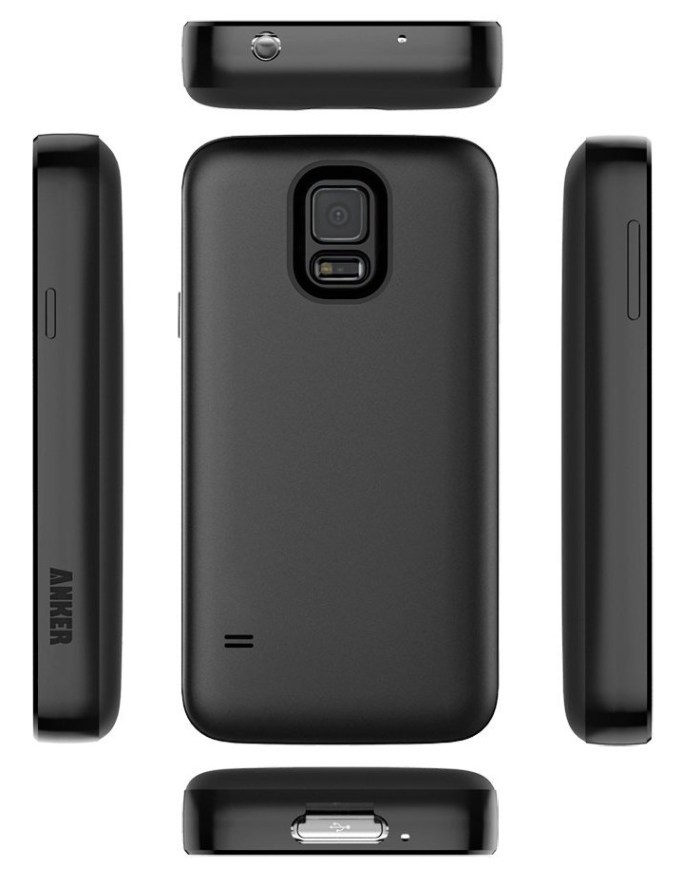
Product Review: Anker 7500mah extended battery for Samsung Galaxy S5

I recently upgraded my phone to a Samsung Galaxy S5, after several years running on a Galaxy SII. While the SII was the best phone I’d had up until that point, there were a number of problems that I had with it, which got especially aggravating toward the end of my time with it. The biggest being ongoing support of the firmware, continually degrading performance over time, necessitating periodic factory resets, and battery life.

Even when brand new, the battery drain on the SII was a serious problem for me, and led to me feeling like I was chained to a power outlet. I’d lose 10% while disconnected from charge for 40 minutes, the length of my commute to work. And yes, I looked in to every conceivable thing you could possible think of to identify causes of drain and do something about them — nothing worked. I bought an extended 3800mah battery for it, which helped a bit, but even so at times I would see the phone draining impressively fast — 1% per minute, on many occasions.

I came to the conclusion that an ideal smartphone should be about an inch thick, and be about 90% battery by weight.

When I went shopping for a new phone, I was really unsure of whether I would want to consider one of the newer generation Samsung Galaxy phones. But ultimately, I selected the Galaxy S5. The non-removable, non-upgradeable battery on the S6 is one of the main reasons why I went with the S5 over the newer model. The other major reason was the lack of a SD card slot on the S6. While looking at extended battery options for the S5, I found that there were a few super-sized batteries offering 5500mah+ — including a 7500mah battery from Anker, and a 8500mah from ZeroLemon.

I went with the Anker for two reasons: the case looked like it would be more comfortable in my pocket, being less bulky if perhaps less armored than the ZeroLemon. And two, the battery was shaped in such a way that it would not block the external speaker, which is an issue with a number of the other extended batteries.

Thankfully, I found that the S5’s battery life on the stock battery wasn’t bad at all, going 10-14 hours on a charge before it got below 20%. That’s almost a full day on the go. But I still wanted to see what it would be like to live completely free of battery anxiety, and this does it for me. Maybe someday they’ll integrate transparent solar cells into the touch screen so that we can charge while using the phone, and at that point a smaller battery might make sense. But I think, minimum, a smartphone with today’s power draw characteristics needs a good 5000mah on tap at a minimum in order to be useful.

With the 7500mah battery from Anker, I am completely satisfied. I have had days where I unplugged at 7am, and didn’t charge it at all throughout the day, used the phone quite a bit, and yet still had a 65% charge by 10pm. Knowing that I don’t have to worry about my battery draining, and can still use my phone, makes me feel like I really have a phone, and not an emergency device to use sparingly if at all. And not needing to stay within 6 feet of a power outlet all the time feels like complete freedom.

anker7500-2 anker7500

It makes the phone heavier and thicker, but these are not a big deal. It’s well worth it to have a phone that I can use all day, and really use, without running the battery critically low in just a few hours. I feel that this should be the standard battery performance for any smartphone. It’s pretty much a must-buy.

The only real downside to the battery is that the way they designed the case, it makes it basically impossible to use the fingerprint reader/heart rate monitor. If you want to use that feature on your phone, you may want to look into a different battery. Samsung makes an OEM extended battery with 3500mah capacity, which, based on the performance I saw from the stock 2800mah battery that came with my phone, is probably adequate for an estimated 16-18 hour day of moderate to heavy phone use. There are some other larger batteries between 3500 and 7500mah from various other manufacturers, but I don’t know how reputable they are, and it’s not uncommon for false, inflated capacity claims from the no-names, so be careful. The Anker, at least, is the real deal. Highly Recommended.

Buy it

The Best Laptop Keyboard Yet Devised By Humankind

Laptop ergonomics are always a compromise. If you put in long hours on a laptop, you know how important comfort and usability are to productivity. So getting the best possible ergonomics given the constraints imposed by the design requirements is extremely important.

It seems many hardware design engineers have forgotten this. The quest for thinner, lighter, cheaper seems to have overshadowed comfort and usability, durability and ruggedness. With each passing hardware generation, we see the same refrain: “The new keyboard is not so bad, once you get used to it.” If we have to get used to a “not-so-bad” keyboard with every generation, doesn’t that suggest that they’re getting worse over time?

And yet, the keyboard is the one component of a laptop that you have the least configuration options for. There are no choices, no upgrades; the keyboard is the keyboard, and you get whatever the manufacturer designed. That means it’s all the more critical that manufacturers give their customers the best possible keyboard.

What if manufacturers gave us keyboards that didn’t take “getting used to”, but felt fantastically comfortable from the moment you used them?

Without a doubt, the best keyboard I have ever seen or used on a laptop has been the keyboard of my Lenovo ThinkPad T61p. It’s no secret, and everyone who’s used one knows how good they are and how far short any other laptop keyboard compares. This keyboard is so good that I’ve continued to use my T61p originally purchased in 2007. After my original T61p died this January, I shopped around looking at the new ThinkPads… and after looking at what was available, I went to eBay and bought myself another T61p.

I won’t be able to do that forever. Already, I feel a need for a machine that can support more than 8GB of RAM, and the new Core i7 CPUs are so much faster than my by-no-means inadequate 2.4GHz Core 2 Duo. And the battery life we see with the current generation of “ultrabooks” in 2015 is impressive.

Will we ever see a return to the keyboards of yore? It wish that it was not in doubt. But I have hope. It appears that Lenovo has finally responded to customer feedback, when this spring they brough back the old style trackpads with physical buttons that had disappeared with the 540 generation. And today, it appears that they are actively soliciting fans of the old ThinkPad brand to ask them what features made the old ThinkPad so legendary. And they updated the X1 Carbon with a more standard keyboard layout in response to complaints and criticism over a senseless radical departure from the norm. Perhaps we’ll glimpse perfection again someday.

To be sure, we will not see a return to greatness if we fail to recognize the things that made the best keyboard of all time so great.

Close to perfection

Behold, The T61p keyboard in all its glory.

T61 keyboard - crop

Let’s take a look at what makes this keyboard so great.

The Good

Full-size keys, spaced the correct distance apart. This makes typing for long periods of time less tiresome, especially for people with larger hands.

Scissor Switch technology allows for longer travel for a laptop keyboard, which is more comfortable than “chiclet” keys. It’s not a full height keyboard like you’d find on a desktop class machine, but it’s very close, giving it a good feel and making it more comfortable again for long typing sessions.

The layout of the non-standard keys is ideal.

It’s important to appreciate how critical the placement of these keys is. Let’s look at them in detail.

A full row of Function Keys, F1-F12. In many newer layouts, this row is eliminated and the F-keys are combined with other keys. This makes compound keystrokes impossible if the F-key needs to be pressed at the same time as the key it is combined with. That’s probably pretty rare, but it is still nice to have this row of keys to themselves. I think keyboard designers eliminated this row in order to make room for larger trackpads. I don’t like large trackpads for a few reasons, which we’ll get into in the Trackpad section.

A full row of real F-keys

The arrow key cluster. Most importantly, the arrow keys are all full-sized, and arranged in an inverted “T” formation. Many keyboards save a key by squishing the up and down arrow keys into the space of a single key, putting all four arrow keys in a line, but this space savings comes at a cost of making up and down half sized, and makes controlling games that use the arrow keys way harder.

The other important thing about this cluster is the presence of the “Previous page” and “Next Page” buttons to either side of the up arrow. These are often replaced with “Pg Up and Pg Dn” buttons. I like “previous” and “next” here because it makes navigating web pages with this cluster very fast. I don’t have to move my fingers at all and I can scroll and hit the Back button or Forward button in a web browser. It’s very convenient, and I really miss it whenever I have to use a keyboard that doesn’t have this layout.Arrow Keys + Fwd-Bck buttons = awesome document & browser navigationThe Insert|Delete|Home|End|PgUp|PgDn cluster. I really like these where they are, too. Being at the top right corner of the keyboard makes them simple to find by feel, without having to take my eyes off the screen. The Home/End and PgUp /PgDn pairs go very naturally together for navigating text documents with the keyboard. These navigational shortcuts are a great alternative to scrolling with the mouse wheel, and for moving the cursor when text editing. Insert and Delete change the cursor mode, Home and End can take you to the beginning or end of a line of text, while Ctrl+Home or Ctrl+End will take you to the beginning or end of the entire document. Pg Up and Pg Dn are better for scrolling than the mouse is, moving an entire window height up or down at a single keystroke. Clustering them in this arrangement makes for very intuitive and quick document navigation using the cursor, and enables me to be much more productive when working in text files or reading than if I have to move my hand to the trackpad or mouse.

Insert-Delete-Home-End-PgUp-PgDn = logical layout perfection

Print Screen, Scroll Lock, and Pause/Break. These don’t get used a whole lot by most people. I use Print Screen all the time, to make screen captures, but the other two hardly at all. Putting them up here out of the way works. Having Print Screen at the left edge of this 3-key row makes it easy to find by touch, without having to take my eyes off the screen to look for it.

PrScnSysRq-ScrLkNumLock-PauseBreak

While we’re looking at this group, note the power button (the circular button at left.) While not part of the keyboard, proper, I will remark that I find the power button difficult to find by touch. If I’m fumbling around in the dark, it’s easier to find the ThinkVantage key, which feels more like I’d expect the power button to feel like. So, one thing I could recommend is change the power button, locating it closer to a corner of the keyboard, and give it a shape and feel more befitting a power button.

Keycaps shape and feel

All the keys are just shaped right. These keycaps are close to what old classic IBM Selectric typewriters and Model M keyboards felt like, and those were some of the best keyboards ever manufactured.
The best type of keys for a laptop

The Enter key isn’t L-shaped, which leaves room for the \| key directly above. The \| key doesn’t really have a reason to be larger, but it keeps symmetry with the Tab key on the left side, and helps a touch typist feel this edge of the keyboard. Esc isn’t double-sized, as it is on some later model Lenovo keyboards — I think making it the size of the Ctrl key, slightly larger than the standard key, would make it easier to find by touch. Ctrl is slightly wider than standard, but I like that, although it would be better if Ctrl were in the position occupied by Fn, where it belongs. Backspace is another good key to be larger than standard, as it is used frequently by most, and this makes it easier to find in the top right corner.

Sufficient Key Rollover: a must have

[Updated 4/20/2016]:

Keyboard Rollover is is the ability of a computer keyboard to correctly handle several simultaneous keystrokes. N-Key Rollover (NKRO) is the ideal — it means that the keyboard can handle any number of simultaneously key presses. At a minimum, a good keyboard should have 6KRO.

I’ve mostly used high-end keyboards that have high #KRO or NKRO, and have only recently encountered a keyboard with low KRO. Unfortunately this happens to be my new ThinkPad P50, which is a great laptop in most respects, but it has a paltry 2KRO. If I’m holding down more than two keys simultaneously, a third key press often is not detected (depending on which keys are down). This makes the keyboard hopelessly unsuited to gaming, and as a game developer, this is really not acceptable.

You can test the key rollover of a keyboard by holding down both shift keys simultaneously and then trying to type the alphabet. If any letters don’t type, your keyboard has low rollover. This should never, ever happen on a high end machine. Or any machine, really.

Nitpicks

Fn/Ctrl positions should be swapped

On most keyboards, the Fn key is nested between the Ctrl and Windows keys. On the T61p layout, this is reversed. There’s no reason for it, and it’s one of the most common complaints about the T61 layout. In fact, there are even third party firmware hacks to remap the keys into their preferred positions: Ctrl outside, Fn to the right. In the ideal keyboard layout, Ctrl should go first.

switch Ctrl-Fn positions

Controversial items

10-Key or not 10-Key?

Many widescreen laptops have 10-key numeric keypads these days, much like 104-key extended keyboards on desktop keyboards. This forces the main keyboard off-center with respect to the screen, which means that the users arms and hands will have to skew left of center the majority of the time when typing, which feels awkward. Unless you do a large amount of numeric data entry, a 10-key is not necessary or recommended for a laptop keyboard. Thankfully, at least the trackpad is still centered under the space bar, keeping it directly between the hands on most laptops with extended keyboards that incorporate a 10-key pad. But typing on the QWERTY keyboard, with the hands offset relative to the screen is less comfortable. The extra keys of the 10-key pad also add to the complexity and cost of the keyboard.

Most users don’t need a 10-key pad, and can live without. Unless you’re doing heavy numerical data entry, they don’t add of value. You could always buy a USB 10-key pad as a peripheral and use that if you needed one. Before laptops started sporting 10-key pads on the right of the main keyboard, they used to use the Fn key to use the right half of the keyboard as a sort of slanted 10-key option. I’ve never bothered switching into this mode, and don’t miss a 10-key pad. So, my preference would be for a regular QWERTY keyboard, without a 10-key pad, and the QWERTY keyboard and touchpad centered in the laptop chassis.

Still, some people will want 10-key pads and others will not — and the number who do not is not inconsequential. But the number of people who can’t live without a 10-key pad is much smaller than the number of people who don’t need it. I would prefer not to have a 10-key pad in my ideal laptop. This would be a good item to make a configuration option at time of purchase. Modular, interchangeable keyboard FRUs that have or omit the 10-key pad would be a great solution.

Are backlit keyboards necessary?

Again, some people like them, and some don’t. Illuminated keys can be helpful when typing in low light conditions, but they drain battery and add cost to manufacturing, although probably not significantly, since most laptop keyboards seem to use them these days. Most of them have an option to turn the backlight off and adjust the brightness level, and this seems to be the best choice. It enables everyone to be happy. On laptops which have this feature, I just turn the backlight off, and touch type as always.

Which type of switches is the best?

This is subjective and people can have their own opinions. These days, there are three main types of keyboard: chiclet, dome, and buckling spring. The T61p keyboard had scissor switches, a type of dome switch. These work and feel great — almost as great as buckling spring switches.

I find “chiclet” keys to be fine, I can use a chiclet keyboard without issue, and type fast and with confidence with them, but I still prefer the feel of the scissor switch keys on my T61p. Some people prefer the lower travel of the chiclet key, and manufacturers favor them today because they enable thinner designs. But I really prefer the feel of the full travel key caps, and the scissor switches in the T61p keyboard give a closer approximation of the way full travel keyboards feel.

The biggest disadvantage of the scissor-switch keyboard is that it adds to the overall thickness of the machine, but I strongly believe that thinness is a highly overrated feature. With ultra-thin laptops approaching 0.5 inches, there’s not much room left to go thinner. And there’s plenty of leeway for making a laptop a little thicker to allow for a better keyboard. The T61p is 1.4 inches thick, and I’ve never once felt that it was an issue. I would much rather have a thicker, heavier laptop that is more rugged and will hold up to years of heavy use, and has more room for expansion or battery, than a ultra thin and light laptop.

Really, though, on the switch type, I could go either way. Chiclet keys feel nice enough to be acceptable, but for longer typing sessions I truly like the additional travel and resistance of scissor switches. This is an area where making it a configurable option would be nice. A modular, interchangeable FRU keyboard offering the user their choice of chiclet or scissor switch keys would make everyone happy.

Pointing devices

While we’re at it, let’s look at the pointing devices. First, we have the TrackPoint stick, the red nub. People who use them really love them, and they don’t get in the way of people who don’t. They’re a vital part of the ThinkPad brand and image, and should never be done away with.

Next, we have the touchpad. The touchpad is surrounded top and bottom with physical mouse buttons. these are well designed and robust. Positioning them top and bottom is important because it makes them reachable to both the thumb and fingers, regardless of where the hand is positioned on the keyboard or touchpad, which makes using the buttons quicker. We also see a middle mouse button, which is useful for Linux users.

As for the touchpad itself, it is only 2.25 x 1.5 inches — which is ideal. Newer generation notebook PCs have trended toward larger touchpads, which allows for greater precision with reduced sensitivity, but I really prefer this smaller size. It is not so large that it becomes an easy target for accidental bumps by the palm of the hand. I never accidentally brushed the touchpad on my T61p with the heel or palm of my hand when typing, which means I never accidentally click the mouse cursor away from where I’m typing. I do have this problem on many newer model laptop keyboards, and it is a constant, huge annoyance.

The touchpad is not multi-touch capable, and that would be a good improvement to add to this design. It does have scroll regions at the right and bottom edge, which are configurable.

The UltraNav touchpad driver is excellent, with lots of configuration options to get it to work just how the user prefers.

T61-trackpad

What else?

It’d be great if keyboards were more interchangeable in laptops, across different models and manufacturers. It would take a great effort of the industry to standardize the top half of all laptop chassis to have the same shape and size space for a keyboard. But there’s no reason it couldn’t happen, if manufacturers decided to standardize, or if a manufacturer decided standardize within their own product lines. The computer industry has standardized on other things, so why not a standard to allow laptop keyboards to be more interchangeable between different models and makers? This could spur innovation in improving keyboards, since users would not longer be stuck with whatever the designers engineered for a particular model — users would be free to upgrade and choose the style and layout that they prefer.

I doubt that it will happen on an industry-wide level, that we’ll be able to buy generic commodity keyboards from any maker and put it into any laptop, there’s just too much inertia for it. But it could happen if the industry decided it wanted to. Even if it didn’t want to, manufactures could standardize more within their own model lines, and offer a greater variety of keycap types and layouts to satisfy the preferences of different customers. I expect the main reasons they don’t do so have to do with cost, and to some extent integration and aesthetics issues. But these are not insurmountable issues.

For me, a better keyboard is still well worth paying some premium for. A keyboard that doesn’t feel cramped, has a familiar layout for ALL keys, and a satisfying feel, for me, would be something I’d easily pay another $50-100 for, if it were an option to purchase an upgraded keyboard that was just the way I like it.