Font Units
The following table shows font sizes in different units for comparison:
| pt | px | em | % |
|---|---|---|---|
| 9pt | 9px | 0.05625em | 56.25% |
| 10pt | 10px | 0.625em | 62.5% |
| 12pt | 12px | 0.75em | 75% |
| 14pt | 14px | 0.875em | 87.5% |
| 16pt | 16px | 1.0em | 100% |
| 18pt | 18px | 1.125em | 112.5% |
| 24pt | 24px | 1.5em | 150% |
| 36pt | 36px | 2.25em | 225% |
| 48pt | 48px | 3em | 300% |
| 60pt | 60px | 3.75em | 375% |
| 72pt | 72px | 4.5em | 450% |
Which column is biggest?
It will depend entirely on the client, and it will depend in part upon their software settings as well as the physical characteristics of their hardware.
Points are defined to be equal to 1/72 in. Back in ancient times, 72ppi monitors were the norm, and pixels and points were thought of as the same. These days, higher pixel density is the rule, so for most screens, the px column should be smaller than the pt column. If the PPI were very low, as might be the case on very old hardware, then the reverse might be the case.
This shows a problem with using px, which is that as pixel density increases, pixel size goes down, and thus what once was readable may not be. In the not too distant future, we may have 300ppi screens that will make these fonts far too small to read. Despite this, most browsers use a default font size setting which is expressed in pixels. Using px makes your web page device-dependent. Fortunately, modern browsers now have zoom controls that work well, so when super-high pixel density comes you should be able to just zoom the page more.
Comparing the em column against the px column, they should be the same size, as long as the browser's default font size has not been changed from 16px, which has become a de-facto standard amongst popular browsers. If the user has changed this setting, it will be anyone's guess which column will be bigger. If the user has changed their browser's settings, they have a good reason for doing so, and as a developer you should strongly consider whether you should try to second-guess this. If you do need to assert more control, you can define a font size for the body element in pixels or points, and this will help ensure that your calculated font sizes where you are using em units will be correct. Since all elements that display in the browser window are children of <body>, you can use ems and percentages from there on out, based on the calculated values that you derive from the size you set for the body element.
As well, if the user agent is an obscure or older browser, it may use a different default size or may even use a different unit than px.
On most computers, 16px will look close to 10pt or 12pt. 12pt is commonly the default font size in most word processors, and is easy to read without magnification for most people.
Other units of measure may be used in CSS, as well: pica, inches, mm, cm, and so on. These are not customarily used with fonts, but with widths and legths for other types of units. They are not very useful for screen stylesheets, but for print stylesheets they are pretty useful since the printed page is typically measured in familiar units like these.
Font size - different units for different purposes
Points
If you're writing a CSS file for print devices, it probably makes sense to use pt units for defining type. Points are the traditional unit for print.
Pixels
If you are writing CSS for a specific device, such as Kindle, with specific, known pixel dimensions and pixel density, or if your page layout is highly dependent upon bitmapped images of specific dimensions, and precise sizing is important then px might be a good choice. But beware device dependence.
Em
For screen stylesheets, em is the preferred unit. Em is flexible and adaptable. If you're using ems for defining your font sizes, go all the way and use them for defining other dimensions, such as the width of a block element that will contain text. That way, if the browser changes font sizes, the containing element will resize to keep proportion with the increased font, and the layout will scale nicely.
Calculating to convert from a known pixel dimension to an em dimension is easy enough. Since the default 1.0 em is defined as 16px, simply divide your known dimension by 16, and that's the dimension in em units. (Just keep in mind that if the parent element redefines the font size the calculation will be different.) You can find em calculators on the web (Here's a good one.) The one thing to be careful about when using em units is that the em is defined by the parent element. The browser's default font size is 16px, so 1.0em in the <body> element is 16px... unless the user has modified their preferences, or you've defined a CSS rule for body that changes the font size to something else.
Changing Em values Example
Say you decide to set a rule like body{font-size:12pt;} Now, 1.0 em is equivalent to 12pt. If you put a <div class="header"> inside that 12pt <body>, and set a CSS rule .header{font-size:3em;} that 3em size will look to the parent element, the body, and see that 1em should be equivalent to 12pt, and so 3 em would then be 36pt. Say you've got a subtitle inside of your head, styled with a .subtitle class: .subtitle{font-size:0.5em;}. How big is that? Body = 12pt; Div.Header = 12pt; Span.subtitle = 18pt (not 6pt).
.EMbody {font-size:12pt; background-color: white; border: solid thin blue;} .EMheader{font-size:3em; border: solid thin red;} .EMsubtitle{font-size:.5em; border: solid thin #888;} .EMexample{background-color:#aa00ff; border:solid thick black; padding:1em;}This is 12pt. font inside of the .embody element.This is 36pt font inside of the .emheader element. It is 36pt because the .emheader is a child of .embody; if it were the child of some other element with a different rule for font-size, it would be 3x whatever the size of its parent is.
And this is the .emsubtitle, which is 0.5 the size of its parent, the .emheader -- or 18pt.
Use child-of rule and proportional units to recursively shrink/grow elements. This is useful for nested lists.
ul.nested {font-size:2em;} ul.nested li li {font-size:80%}
- List items
- Nested list item 1
- Nested list item 2
- Nested list item 1
Embedded Fonts in CSS3 vs. "web safe fonts"
Up until now, web developers have taken a number of approaches with fonts. Most text in web pages is displayed using one of a small handful of "web safe" fonts. This is something of a misnomer, as there is no such thing as a truly web safe font, but the term basically means a font that is so commonplace that it is very likely to be installed on the vast majority of client systems. In practice, this is a very short list, and there is not universal agreement on what fonts should be on this list. I won't bother providing an opinion as to what the list should be, as there's plenty of opinion out there already; just google for Web Safe Fonts and make a decision.
Because there is no 100% guarantee that a font will be present on a client system, there is a need to have fallback options. In the font-family property, you can provide a list of fonts in order of preference. The browser will look for a match in this list and use the first match that it finds in the list. If no fonts matching the named fonts in the font-family declaration appear, the browser will display the text in whatever the default font is as configured in the application preferences. The last font family listed in the declaration should be a generic family name, eg, "Serif", "Sans-Serif", "Monospace". This will ensure that the text will display in a font which is as close an approximation to what the designer intended as is possible on the system.
There are times when this approach is not acceptable, however, and a specific font is required, such as when displaying a corporate logo or trademark. The most common solution for this has been to serve the text as a rendered image of the text in the desired font. You end up with a picture of the text that looks exactly how you wanted it to look. However, there are limitations with this approach. A screen reader won't know what the words are that appear in the image; you can provide an alt tag to fill in this gap. The image will not scale as nicely as real text will. In older browsers images might not scale at all; older browsers only scale text larger and smaller, and do not do content zoom like modern browsers now do. In some cases, embedded Flash objects may be used to display text. This approach, too, can suffer from accessibility problems. Many savvy users block Flash for many good reasons (performance and stability issues, resource consumption, privacy concerns, intrusive animations and advertisements) and may not see your super fancy Flash text. Flash at least scales nicely, since it is vector based, and can be done in a way which is accessible, as long as the Flash object isn't blocked or disabled. If you decide to take a Flash approach, be sure to embed it in such a way that it degrades gracefully, falling back to an image or plain text if all else fails. Avoid over-using Flash, and try to avoid using it unless it is truly called for.
A very good explanation for embedding downloadable fonts into your web page.
.FontDemo {font-family:IE-MTCorsiva, Local-MTCorsiva, Server-MT Corsiva, Serif; font-size: 3em;} @font-face { /* you can name the font-family anything you want. Use quotes if you have spaces in the name. */ font-family: IE-MTCorsiva; src: url("MTCORSVA.eot") /* EOT file for IE */ } @font-face { font-family: Local-MTCorsiva; /* by using the locally installed font, if available, we can speed up rendering and reduce bandwidth. */ src: local("Monotype Corsiva"); } @font-face { font-family: "Server-MT Corsiva"; src: url("MTCORSVA.TTF") format("truetype"); }
If your browser supports the CSS3 feature for @font-face, this paragraph will display in a special font.
Notes:
- In my experience with it so far, @font-face does not work reliably. Browser support for @font-face is still spotty. You'll need to test extensively with the browsers you want to support in order to ensure it works properly.
- IE only works with .eot (Embedded Open Type) fonts, which no other browser supports.
- There are .ttf->.eot converters freely available on the web. Whether they are legal to use depends on the licensing terms that you are bound by with the original font file.
- Mozilla and Webkit browsrs support OpenType (.otf), TrueType (.ttf). The future will bring Scalable Vector Graphic (SVG) fonts; Safari on iPhone already supports this.
- Fonts are copyrighted and licensing can get you into trouble if you don't understand your license terms and use the font in a way which you are not allowed. Be careful. Use unencumbered fonts if at all possible, or be prepared to spend money.
Bugs:
- Mozilla does not seem to support the url("") source when I test it on my computer, even though it should definitely work. It only seems to work with local("") for some reason. If you don't have MT Corsiva installed locally, Mozilla may not render the font correctly, and will fall back to your default font, even though MT Corsiva is being served by the web server and should work.
- Chrome, conversely, seems only to work with the url("") source. I can't get it to use the local copy of MT Corsiva that I have installed on my computer.
- I should be able to declare the font-family all in one single property, like this:
@font-face{font-family: "MT Corsiva"; src: local("Monotype Corsiva"), url("MTCORSVA.TTF") format("truetype"), serif;}
But if I try to put the code all in one declaration like this, it breaks both Firefox AND Chrome.
Once embedded fonts work well, they'll be great. That should be very soon.
Styling Text
Styling text is a pretty basic thing. There are a lot of properties that you should be aware of. There's nothing tricky about using them, but I've included this here for an easy quick-reference.
| Property | Description | Values |
|---|---|---|
| color | Sets the color of a text | color #[0..f][0..f][0..f] rgb([0..255],[0..255],[0..255]) |
| direction | Sets the text direction | ltr rtl |
| line-height | Sets the distance between lines | normal number length % |
| letter-spacing | Increase or decrease the space between characters | normal length |
| text-align | Aligns the text in an element | left right center justify |
| text-decoration | Adds decoration to text | none underline overline line-through blink |
| text-indent | Indents the first line of text in an element | length % |
| text-shadow | Creates a shadow of the text. | none color x-offset y-offset blur-radius |
| text-transform | Controls the letters in an element | none capitalize uppercase lowercase |
| unicode-bidi | normal embed bidi-override |
|
| vertical-align | Sets the vertical alignment of an element | baseline sub super top text-top middle bottom text-bottom length % |
| white-space | Sets how white space inside an element is handled | normal pre nowrap |
| word-spacing | Increase or decrease the space between words | normal length |
Examples using Transparent named color
One of the "named" colors in CSS is "Transparent."
You can use it to make stuff... get this... transparent. It's used mostly for background-color of objects, when you want to show the color of the parent element or a layered element beneath. A lot of elements have transparent background color by default in most browsers. A good way to remember how Transparent works is, it allows you to see through the object to its PARENT. Unless of course it is positioned in such a way that it is actually outside of its parent. But, you get the idea. You can see through it to whatever is behind it.
Some browsers support "transparent" for the color property as well as background-color, but not all do so. If you want to make the foreground color of an element transparent, use visibility:hidden instead. Or, if you want the element not to take up any space at all, use display:none.
In this example, I'm going to put a <div> inside of another <div> with a red background and width set to 50% of the window.
This text is in a <p> which is styled color:transparent. It may (Mozilla, Chrome) or may not (IE) display transparent, depending on whether your browser supports Transparent for foreground colors. If it is transparent, you will only be able to see it if you highlight the text, just as if you were using the same foreground and background colors.
Transparent also works for borders. This div uses a 10pixel border, which is transparent, so the background color shows through the border, giving an effect that looks like we have padding here, when in fact it is actually a border. This isn't all that useful... but it shows that the background-color of an element extends "beneath" the element's border.
Of course, we could just as well have just used padding, or matched the border color to the background color.
Margins are always transparent.
Examples using Opacity
We'll demonstrate opacity with an image, but you can apply it to other types of elements as well. W3C provides a standard property called "opacity", but it is not supported by all browsers yet. Proprietary CSS is needed to ensure coverage for all browsers.
In this example, I have coded a rule that results in a 40% opaque effect. The image at left is unstyled for comparison. The IE "filter" property accepts values ranging from 0-100, while the other properties range from 0.0 to 1.0. In IE8, using this rule counts as "running scripts or ActiveX controls that could access your computer", so the effect will not work if you do not "Allow blocked content" -- which isn't too great if you're depending on the transparency to work for everyone. Nice work, Microsoft.
.transparent40 { -ms-filter: “progid:DXImageTransform.Microsoft.Alpha(Opacity=40)”; */IE8, important to place prior to the old "filter" */ filter: alpha(opacity=40); /*IE <8 */ -khtml-opacity: 0.4; /* For KHTML-based browsers (konqueror, old Safari) */ -moz-opacity: 0.4; /* For older Mozilla browsers */ opacity: 0.4; /* For w3c-compliant browsers (webkit, newer Moz) */ } <img src="pug.jpg"> <img src="pug.jpg" class="transparent40"> </style>
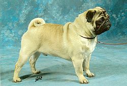
(Pug image from Wikipedia, used under creative commons license)
You can combine transparency with positioning and z-index layering to achieve cool effects. A little javascript and some user controls can give you a way to show/hide layers or shuffle their ordering in the z-index stack.
Box model (compare in FF vs. IE)
This black bar is 500px wide image, for reference.
The outer border around the box model example represents the outer edge of the margin of the inner div. It will not look right if you're viewing with the IE box model.

This element is inside of a <div> that has been sized to 500px wide, with 20px of padding and 20px of margin and a 5px dashed red border. If you are viewing this page in an older version of IE, you can see the IE box model in effect.
The w3c defines the width property as the size for the *content* region of the element, not including padding, border, or margin. The IE box model includes the padding and border regions as taking up part of the defined width of the element's box.
Compare side by side using IE and a w3c-compliant browser to see how they differ. If you don't have an old version of IE and want to see this in quirks mode, remove or comment out the DOCTYPE declaration at the top of this HTML file.
Or, if that isn't easy, use a pixel ruler to measure the width of the element from border edge to border edge. Pre-IE7 and IE>5 in quirks mode includes the padding and border in the width, so the overall width for the IE box will be 500px from the outside edge of the border. In a w3c-compliant box, the content will be constrained to a 500px area, with an extra 20px for the padding outside of that, and an extra 5px of border outside of that, for a total of 590px of width as measured from the outside of the border.
If you want to banish the box model bug, all you have to do is declare a doctype and conform to it. Then any recent version of IE will behave. Even IE6.
If you're getting box model bugs in these versions IE, it's because IE is rendering in quirks mode; if you can figure out why, and fix the problem, then IE will behave. If your HTML is correct but IE *still* renders in quirks mode, you can either ignore the problem or supply a conditional stylesheet that has adjusted width definitions for those elements that exhibit width problems in IE.
Lastly, notice that despite the fact that this <div> element has a yellow background, the margin remains transparent, showing the white background of the <body> element.
Positioning Examples
Positioning is probably the toughest thing about CSS 2.1 to grok. Add to that all the problems that different browsers have in implementing support for CSS positioning, and it becomes an even more difficult challenge. Getting your positioning rules to work right in every browser puts a significant amount of suck in a web developer's life.
First, the basics.
There are four modes for positioning in CSS:
- static,
- relative,
- absolute,
- and fixed.
position:static
Static is the "normal" or "default" positioning method. Each block element in a static layout is rendered on its own line, in the order that they are found in the HTML document, starting from the top of the page, going to the bottom of the page, and normally flowing from left to right. Text and inline elements will follow this left to right flow, and will break as needed, depending on the width of the parent or the window pane.
A word on direction
Normally the direction of flow is left to right, but you can use direction:ltr to make this explicit if you need to for some reason, and if you want to do right-to-left, you can do direction:rtl.
Some non-western languages flow rtl, and you might want to use it for novelty, although it seems to work just like text-align:right, so I'm not sure why this even exists. The term "direction" would seem to suggest that if you used rtl, it would invert the order of characters, reversing the string and writing backwards, but no, it doesn't work that way. You can only change direction in a block element; doing it to an inline element, such as a rtl <span> inside of a ltr <div> will not work.
Try viewing source and uncomment the style rule below this line for body{direction:rtl} and then reload the page and see what it does.
position:relative
Relative positioning is closely related to Static positioning. With a relative positioned element, it maintains its placeholder in the document's static flow, but its actual drawn position is shifted relative to where it should have been in Static positioning. This will leave a "hole" in the rendered document that other static-positioned elements will flow around, "honoring" the static position that the relative element still holds onto. The relatively positioned element doesn't respect the space taken up by other static elements, however, as you can see if you view source and uncomment the rule "top:40px;"-- it will overlap the static-positioned paragraph following this one, as necessitated by the offset rule applied to the relative-positioned element.
In fact, if you don't specify an offset, a relative positioned element will appear exactly where it would have if it were positioned static, and will be virtually indistinguishable from a static element.
To specify the offset, use the rules top, left. You can use pixels, ems, percentage, or other units, and positive or negative numbers. Since you can use negative numbers, there is no bottom or right for relative-positioned elements. This omission of bottom and right rules for relative-positioned elements prevents conflicts, and eliminates the possibility for the need for the browser to calculate a relative offset by adding top and bottom together.
Note that if you left-shift something past the 100% width of the window, you'll end up causing a horizontal scroll bar situation, which is generally something you will want to avoid. No one likes horizontal scrolling -- unless it's in a videogame:)
If you offset by a very large negative number, you can effectively "hide" an element offscreen. (A high positive number will offset the element to a far away place where the user will be able to scroll to, however.) This is probably not the best way to hide an element, but it was common a few years ago, before display: and visibility: were widely supported. It's also possible to hide an element behind another element using z-index. You might find all of these techniques still in use in the field, particularly on older sites that have not been updated, or sites that are trying to cater to ancient browsers.
The most important thing to know about relative positioning is the least obvious and the most useful. When you position an element relatively, you create a new "scope" within the document. "Scope" is what defines the flow for static objects. By creating a new scope for itself, a relative-positioned object with children has its children shift along with it. This means that an Absolute-positioned element that is a child of a relative-positioned element inherits this scope. So, if you ever wanted to know how to define an element's position relative to some other element on the page, and not the static flow of the page itself, put your absolute-positioned element inside a container element that is relative positioned, but with no offset.
This might well be the most useful piece of information you'll get out of this class!
position:absolute
Absolute positioning is a way to define the position of an element in terms of the "scope" created by its first parent that is non-static. If there is no such element, it positions itself in an absolute position to the <body>, which provides scope for the entire document.
There are a few things you need to understand in order to use absolute positioning effectively. Your positioning rules are top, bottom, left, and right. Again, as with relative positioning, you can use positive or negative values for these positioning rules, and whatever type of units are appropriate for what you want to do. If you use top AND bottom, you are effectively defining the height of the object implicitly, just as if you use left AND right, you are effectively defining the width of the object implicitly. You should avoid confusing the rendering engine in these cases by not providing an explicit width or height as well. If the values don't match up, the browser's output will be unreliable. It's best therefore to define the positioning of either top/bottom and/or either left/right side, plus a width and/or height, or else to define top+bottom and/or left+right and omit a rule to define the width and height explicitly.
position:fixed
Fixed positioning presents the element in a fixed position relative to the window viewpane. The element will not move when the page is scrolled, and is hence "fixed" in position.
Fixed can be really useful, but it can also be really annoying. Use it very sparingly.
To see the effect of fixed positioning, view source and uncomment the .fixed rule below, and reload the page. The image you see below will be taken out of its static position and placed in a fixed position at the very right of the screen, halfway down the viewpane.
Putting something in fixed position mode will remove it from the static scope of the main document, and create a new scope for the element so that any child element will use its scope.

One final bit about fixed: IE<7 does not support it. If you must support IE6, you'll need to employ hacks, or avoid using Fixed. The hacks involve javascript, and thus won't work if javascript is disabled. They work by updating the position of the element every few milliseconds to create an effect that resembles Fixed positioning, but you'll see jerky behavior from the faux-fixed element when scrolling. In fact, you've probably seen this a million times if you lived on Windows through the IE6 era. Finally, to get IE7+ to work with Fixed, you need to make sure you're not rendering in quirks mode.
More info on the IE hacks for Fixed positioning
Overflow
If you've defined an element's size, the content within the element may overflow its parent if its sizing and positioning rules are such that the content does not fit. You therefore should be aware of the different ways to handle overflow, and apply an appropriate one to the parent element if needed (and it's usually a good idea to do this just in case, since changing default font size or window size might cause an overflow condition that you wouldn't normally anticipate.)
The options for overflow are visible, hidden, auto, and scroll. Visible is the default; the overflowing element will be fully visible. Hidden will clip the overflowing portions of the element, making the overflowing portion of it invisible. Scroll creates a scrollbar that will allow the user to scroll within the constraining element to see the overflow element. One thing I've noticed with Scroll is that if you use it, it will provide a horizontal AND vertical scrollbar if your element overflows, regardless of whether both are actually needed. Auto will provide scrollbars, but only if they are needed; if the entire element fits without overflowing, no scrollbars get created.
Min and Max Dimensions
One thing you can't do with overflow is force the parent element to grow larger to accomodate the over-sized child. The way to make this happen, is to not define the size of the containing parent element so rigidly. Use min- and max- to define a flexible width or height, or don't specify a size at all if you don't need to.
- min-width:
- max-width:
- min-height:
- max-height:
.minmax{border: solid 1px black; min-width:300px; max-width: 700px; padding:0.5em; margin: 1em;}
Min and max height and width are also useful for constraining the size of elements in fluid layouts. Depending on window size, elements with size defined using min and max will flex within their range. Try resizing your window to see how it works. Using min and max not only helps your web site work in the event a user resizes their window, it helps the page to render appropriately for different users who have different sized screens. If it is used well, a visitor browsing at 1024x768 and another visitor browsing at 1920x1080 could potentially both see a web page that looks as though it was designed just for their screen resolution -- no horizontal scrolling for the small screen, no wasted unused blank space for the large screen.
Float and Clear examples
Depending on where you place the floated elements in the document, the text will flow around them at about that point. This paragraph begins in the HTML after the second two floated divs in this example. But as you can see, the content appearing above flows a bit down below the top line of the floated divs. It takes a little bit of trial and error to place floated elements where you want them.
Float causes block elements to behave differently. Ordinarily, nothing else appears on the same horizontal plane of a block element's parent. With a floated block element, if its width is less than the width of the floated element's parent, other elements will wrap around it so long as they fit in the remaining space.
The other thing to know about floated elements is that they may escape the boundary of their parent. This looks like a situation for overflow, but it isn't actually an overflow condition. Setting float on an element causes the floated element to be removed from the scope of static flow, so setting an overflow property won't help you here. And even if the parent that contains the floated element does not have a constraint on its size, a too-large floated element child will not force the parent larger.
Floats can escape their parent if there's no content to break after it.
If you want to stop the subsequent content from wrapping around the floated element, this is where you want to use clear. Clear is used to tell the browser that you want the cleared element to clear floating elements on the left, right, or both sides.
If you have no actual content, use an empty div, set height:0; visibility:hidden and no one will be the wiser.
Display vs. Visibility example
Display
Display is concerned with how the element is displayed.
The most common values for display are inline, block, and none.
There are a bunch of others, used for controlling the display of table elements, list items.
Each HTML element has its own default for its display mode, but you can override that in CSS if you want to. Mostly, this will be to make a block element display inline, or to make an inline element display as a block item.
Here's an unordered list (<ul>) with its list items set to display:inline. Very handy for horizontal navigational link lists.
ul.horizontal li{display:inline}
- item 1
- item 2
- item 3
One other trick I like to use commonly is to set up my site navigation links so that the <a> elements display block. This makes them larger mouse targets. You can hover over any part of the <a>'s box to trigger the mouseover. Since the A is a display:block element, its box extends from edge to edge of its parent div.
Also, by combining the :hover selector and the descendent selector with the display property, we can hide nested levels of our menu until the parent item is hovered over. This works without any javascript, and is a good lightweight solution for a simple menu. More sophisticated menus with dynamically generated code are probably more user-friendly if javascript is available, but this is pretty good for handling the graceful failover in the event that javascript is not enabled.
/*Turn the links into block elements so they'll be easier to click*/ #DisplayNavDemo a{display:block; } /*Hide nested menus until the parent li is hovered over*/ #DisplayNavDemo ul ul {display:none;} #DisplayNavDemo ul li:hover ul {display:block;} /*Cosmetic styling*/ #DisplayNavDemo {background-color:#ccc; width:10em; font-size:2em;} #DisplayNavDemo a{padding:0.25em 0 0.25em 1em; font-weight:bold; color:black;} #DisplayNavDemo a:hover{ background-color:yellow;} #DisplayNavDemo ul {list-style-type:none; margin:0; padding:0;} #DisplayNavDemo ul ul {font-size:75%} /*<a> gets padding instead of li so that the links' box will extend from edge to edge.*/ #DisplayNavDemo ul ul a {padding-left: 1em;}
None The last important value to be familiar with in display is none. If display:none is set to an element, it has no display box. It does not appear in the page, and there is no box to take up space, as there is with visibility:hidden (see below.) If you use dynamic HTML to toggle display:none, the element disappears from the page, its box disappears from the layout flow, and the page re-flows.
There are other display modes to be familiar with as well, and if you learn about them you may find a use for them, but if you know and understand the above, you'll know most of what you need to. I won't cover them in detail, but for completeness, the other possible values for Display are:
- inline-block
- inline-table
- list-item
- run-in
- table
- table-caption
- table-cell
- table-column
- table-column-group
- table-footer-group
- table-header-group
- table-row
- table-row-group
- inherit
Visibility
Visibility is concerned with whether the element is visible or hidden. There are four possible values: visible, hidden, collapse, and inherit.
Visible is default, and what it does is obvious. You can see it.
Hidden hides the element, but effectively turning it invisible. It still takes up space, however. This makes it a good choice if you want to hide something without changing the layout of the rest of the elements on the page.
Hidden elements cannot receive events, so if you coded some OnFocus or OnHover or OnClick event for some element, and then apply visibility:hidden to it, it'll never receive those events. You can use javascript to dynamically toggle between visible and hidden, but the javascript can't be triggered by events received by the hidden element; you have to use events handled by a visible element.
The paragraph immediately below this one is hidden. You won't see it, but you'll see the empty space where it would be if it were visible.
Unlike other methods of hiding an element, such as setting the foreground and background colors to the same value, or using Transparent, a hidden element is not revealed when it is highlighted with the mouse. It will, of course, still show in source.
Collapse is only used for table elements; collapse will remove a row or column from a table, and the space it took up is collapsed*. The second row in this three-row table is set to visibility:collapse. Thus, only rows 1 and 3 are visible, and 2 is nowhere to be found.
| 1 |
| 2 |
| 3 |
Note: Visibility:collapse is not to be confused with the border-collapse property, which collapses adjacent borders together, and is a particularly useful property for styling tables.
*Implementations differ from browser to browser; IE/FF will treat the collapsed element as though it did not exist (behaving essentially like display:none), while Chrome leaves the space that the collapsed element would have taken.
CSS reset
Every browser has default presentational styles that it applies to unstyled HTML. But there is some variance in the specifics between browsers in how their default styles are implemented. This can drive you nuts if you want each browser to render your web site the same. Thus, the css reset was born. The idea of a CSS reset is to override the browser's default styles with a set of consistent style rules to provide a common foundation for the rest of the CSS that you use to do the real presentatoinal work work for the site.
Opinions differ among web dev engineers as to what belongs in a reset stylesheet, and whether they're even necessary or a good idea. Some objections to the reset concept is that it is bloat, and that you should simply account for all the browser differences in your production stylesheet code rather than declare a bunch of "baseline" styles only to turn right around and override most of them with your actual desired styles. Advocates of resets prefer them because they isolate browser idiosyncracies and remove them from further consideration, freeing the developer to think about solving the problem of what they want their styles to look like, and stop having to think about all the convoluted things you have to do in order to achieve consistencey across multiple families and generations of web browsers.
If you do opt to use a reset, you might want to author your own custom reset, but you might also want to use an "off the shelf" reset, either one that you found freely available on the web that does the reset in a way that you like, or if you're using a content management system or framework, it likely provides a reset out of the box. I recommend doing a little research and shopping around and playing with some and learn how they work before you consider attempting to write your own. Writing an effective, yet compact reset takes a considerable amount of knowledge about how all the different browsers differ in their implementations of their default style, as well as in depth knowledge of both HTML and CSS.
Examples
Efficient CSS: Lean HTML, #ID & descendent selectors
div#ID1 h1 { font-face:Tahoma; font-size: 3em; font-style:italic; font-weight:normal; color:#49922; background-color:#a8a; margin:0; padding:10px; } div#ID1 p { font-family: garamond; font-weight:bold; background-color:#a8a; color:yellow; margin:0; padding:10px; } <div id="ID1"> <h1>Hey, check it out</h1> <p>All of the HTML contained in this DIV is completely devoid of style attributes or class attributes. All the style that you see here gets applied to the descendents of the parent <div> element. If it weren't in this div, it would be default-styled HTML. By applying style in this way, through the descendent selector, it enables you to keep much of your HTML bare-bones, which can enhance its re-usability. Don't bother with applying a class to every element when you can apply it once to a container element and achieve the same effect more efficiently.</p> </div> <div> <h1>Hey, check it out</h1> <p>All of the HTML contained in this DIV is completely devoid of style attributes or class attributes. All the style that you see here gets applied to the descendents of the parent <div> element. If it weren't in this div, it would be default-styled HTML. By applying style in this way, through the descendent selector, it enables you to keep much of your HTML bare-bones, which can enhance its re-usability. Don't bother with applying a class to every element when you can apply it once to a container element and achieve the same effect more efficiently.</p> </div>
Hey, check it out
All of the HTML contained in this DIV is completely devoid of style attributes or class attributes. All the style that you see here gets applied to the descendents of the parent <div> element. If it weren't in this div, it would be default-styled HTML. By applying style in this way, through the descendent selector, it enables you to keep much of your HTML bare-bones, which can enhance its re-usability. Don't bother with applying a class to every element when you can apply it once to a container element and achieve the same effect more efficiently.
Below is the exact same HTML code, minus the ID on the containing div. Since the div doesn't have the right ID, the styles don't get applied.
Hey, check it out
All of the HTML contained in this DIV is completely devoid of style attributes or class attributes. All the style that you see here gets applied to the descendents of the parent <div> element. If it weren't in this div, it would be default-styled HTML. By applying style in this way, through the descendent selector, it enables you to keep much of your HTML bare-bones, which can enhance its re-usability. Don't bother with applying a class to every element when you can apply it once to a container element and achieve the same effect more efficiently.
You don't have to apply a class to each and every element, just apply a class or ID to the container, and use descendent selectors to do the rest.
Hover Effects
.hovertext{ font-weight:bold; text-decoration:underline; text-align:center;} .hovertext:hover {background-color:blue; color:red; font-style:italic; font-weight:bold;} /*notice how the style rules from the two .hiddentext declarations combine in the example*/ .hiddentext {display:none; background-color:yellow;} .hovertext:hover + .hiddentext{display:block; border: solid thick red; padding: 3em;}
Note: the text below looks like it is a link, but it is not a link! :hover can be used on any type of HTML element.
Hover over this text and see what happens...
A lot of older browsers only implemented :hover for hyperlinks, but most modern browsers will use it for any element, as they should.
Any effect you can do in CSS can be triggered by hover if you use the :hover selector. I've applied a bunch of garish visual changes to emphasize that; it's not simply about underlining.
It's easy to think of :hover as being just for links, but you can be creative with it and do neat stuff. one of the cooler things you can do is use :hover combined with child-of or descendent selectors to show/hide an element. While cool, in practice it does not work as well as javascript, which can use delays and make something "sticky" so it will stay visible after you stop hovering over the trigger element.
Proprietary and Conditional CSS
In CSS, there is a way to make a rule conditional.
IE supports conditional HTML.
Additionally, there are proprietary extensions in addition to W3C CSS that support features that browser vendors add into their products.
Fortunately, these things are becoming things of the past. CSS resets and the improvement of browser conformance to standards have made conditoinal CSS and proprietary CSS less necessary. If you're required to support old browsers, they can be useful to isolate your more advanced CSS from the old browser. Sometimes a browser will "support" a CSS selector or property or value that you're using improperly, and your CSS will mess it up. That's when conditionals can help you out.
More often these days, you will find that you can just use proprietary CSS selectors. Many of them implement the same feature that the W3C hasn't yet finalized with a Recommendation. Rather than take a guess at what W3C will end up settling on, the browser developer comes up with their own selector and implements it their way. Later, when W3C finally gets its act together and makes their Recommendation, the browser developer can implement the W3C feature and deprecate their own. People who use the proprietary CSS can make use of it, while people who made use of the W3C CSS won't have their site rendered incorrectly. I generally recommend avoiding using proprietary CSS, but when the W3C takes years to figure out their recommendations, sometimes it becomes necessary.
To clear up confusion:
- Conditional CSS tells the browser to apply a CSS rule depending on some condition.
- IE's conditional HTML tells IE to apply some block of HTML depending on some condition. This can be used to make a <link> for a specific version of IE, to link up a stylesheet full of special rules and overrides for that version of IE only.
- Proprietary CSS rules target a specific browser directly. Browsers ignore CSS that they do not understand, so if the browser does not support the proprietary extension, it ignores it without the need to code a conditional statement. In effect, the proprietary selector syntax is the conditional statement.
The syntax looks like this:
Conditional CSS:
Conditional statements
- [if {!} browser]
- [if {!} browser version]
- [if {!} condition browser version]
Browser names
- IE - Internet Explorer
- Gecko - Gecko based browsers (Firefox, Camino etc)
- Webkit - Webkit based browsers (Chrome, Safari, Shiira etc)
- 'SafMob' - Mobile Safari (iPhone / iPod Touch)
- Opera - Opera's browser
- IEMac - Internet Explorer for the Mac
- Konq - Konqueror
- IEmob - IE mobile
- PSP - Playstation Portable
- NetF - Net Front
Conditional operators
- lt - Less than
- lte - Less than or equal to
- eq - Equal to
- gte - Greater than or equal to
- gt - Greater than
IE Conditional HTML:
Syntax
<--[if IE 6]> Special instructions for IE 6 here <![endif]-->
Putting the conditional HTML inside of an HTML comment prevents it from messing up non-IE browsers.
More info.Proprietary CSS:
The W3C Recommendation CSS is widely regarded as the standard for CSS, but this has not stopped every browser developer out there from coming up with their own proprietary selectors, properties, and values. This may seem like a problem, but it is much better than the alternative of every browser developer competing to control and own the standard. Rather than do that, the major vendors have decided to "play nice" and use proprietary prefixes for CSS features that they want to include when the W3C is not quite ready for them to become full recommendations. Thus, if you look at enough CSS, you'll see selectors that start with -moz, -webkit, -ie, etc.
In case you were wondering, Proprietary CSS is listed under Conditional CSS because the selectors provide a sort of conditionality; if the browser rendering the code recognizes the proprietary CSS, it will use it. Any browser that runs into CSS declarations that it does not recognize will ignore them, so they do not harm markup that would otherwise render correctly in some other browser.
By creating their own proprietary CSS extensions to the standard, browser developers avoid stepping on the toes of other vendors and the WC3. Since W3C is extremely slow when it comes to advancing their Recommendations, many developers create proprietary extensions for CSS features that are anticipated to become a part of the W3C standard, years before W3C gets around to defining how it should behave. Web developers are free to use the proprietary CSS markup if they choose to bring these advanced features sooner, and thereby stand out from the crowd. Browsers have also to use these features as selling points for why you should use or develop for their browser. Often, all the major browser vendors will have their own flavor of some desirable feature that they have chosen to implement in their own proprietary way. You can then code the same rule again and again for each proprietary feature that you wish to use, in order to have the feature appear for the majority of your visitors. It's a pain, though, when not all of the implementations work in quite exactly the same way, resulting in a site which displays or behaves inconsistently, depending on what browser you are visiting it with.
While proprietary CSS can be useful and has its place, web developers should be careful not to become over-reliant on it. Proprietary CSS can change on the whim of the proprietor. Once a feature is well-supported in W3C standard CSS, the proprietary versions of the rules should be deprecated. The proprietary features are free to use, but you pay for them in a sense because the code you write will require more maintenance, and be more difficult to maintain.
If you are developing for a closed system with a known, defined browser brand and version, you might want to consider delving deeper into proprietary CSS rules. But if you're developing for a general audience, you should avoid using proprietary CSS as much as possible, using it only when absolutely necessary, or when the payoff is great enough to justify it.
A detailed overview of proprietary CSS is beyond the scope of this course. If there's something you want to do in CSS that you are finding isn't well supported by browsers with just W3C-standard markup, or if one browser is acting up and you need it to get in line and behave like the others, consider investigating what options you have in the proprietary CSS world.
Dynamic CSS
This isn't intended to be a class on Javascript, but you should be aware that you can change CSS rules dynamically using Javascript. This can greatly enhance the web page, but you'll want to ensure that the site degrades gracefully in the event Javascript is disabled or not available. You can use similar approaches to dynamically modify the style of your site using server-side scripting as well.
Without going into great detail, I'll outline a couple approaches that you can take with dynamic CSS.
Using Javascript, you can modify the presentation of the web page in at least the following four ways:
- Change the value of an HTML element's class attribute from one pre-defined class to another.
- Change the value of an HTML element's style attribute.
- Add/Remove/Change the <link> tag in the header to add/remove/switch which stylesheet is applied to the page.
- Edit an embedded stylesheet within the HTML document
For more detailed information on how to do this, check this out.
One might think that you could also use Javascript to edit a linked CSS file, but that is not true, since the CSS file resides on the server. Javascript executes on the client side, and you should never trust client-side code to modify files on the web server like that. You could, however, use server-side code such as ASP or PHP to allow the user to build custom CSS files from a web interface, and attach them to the site so that the site gets modified by their custom styles. You could even allow the user to upload their own .CSS file, but if you do so you will want to validate it before allowing it to be used.
Applying Multiple Classes to an HTML Element
The examples below show paragraphs styled using CSS classes. For demonstration purposes, I've named the classes .bold and .italic. (Normally, you wouldn't want to name your classes for the effect they give, because it makes your code inflexible -- you can't modify the rule without making the name of the class misleading rather than descriptive. But in this case, we want to show how multiple classes can be applied to a single element.)
.bold {font-weight:bold;} .italic{font-style:italic;}<p class="bold">This is bold text.</p>
<p class="italic">This is italic text.</p>
<p class="bold italic">This is bold italic text.</p>
By applying multiple style classes to an element, you can combine the styling that they provide to achieve a complex effect. This saves you the trouble of having to write a third class that combines both rules, such as .bolditalic. The advantage is efficiency -- it's less code to write, less code to download, less code to interpret, and less code to maintain.
Style classes can be combined through inheritance, as well. You might put a list inside of a div, and apply one class to the div and another class to the list; the list will inherit any inheritable style rules from the div.
You could also achieve the same effect by nesting the paragraph within two <span> elements, but the above notation is more efficient, as you can see:
<span class="bold"><span class="italic">This is bold italic text using nested spans</span></span>
In this example, the rules applied by the two classes are simple, and do not conflict. If they did conflict, then the last of the classes to be applied against the HTML element would "win" -- much as the last declared rule in a CSS cascade "wins" when rules conflict.
CSS Sprites
CSS Sprites are a technique to improve load performance while reducing server load. Each file that is called from the server takes a separate httprequest, and the more requests are made to the server, the longer it takes to serve all the required files to build the page. Many smaller requests are less efficient than fewer larger requests.
One way to reduce the number of httprequests is to consolidate all the small images that are used for icons and widgets into one large image file. Then you can use CSS to mask and offset the single image to show just the portion that is needed. It's complicated to set up, and more difficult to maintain, but for a high traffic site it is worth it to reduce server load and improve load performance.
Here's our example sprite, showing two images:
These might be the on and off states for a button graphic in a real implementation. To use the sprite, we need a little CSS, In this example, we're going to shift the sprite when the element is hovered over to show the second image:
.sprite{background-image:url(sprite.png); height:100px; width:100px;} .sprite:hover{background-image:url(sprite.png); background-position:0 100px; height:100px; width:100px;} <div class="sprite"></div>
Here it is in action:
There are a lot of uses for sprites. This demo just gives a taste. Javascript can make them even more useful. On small sites with low traffic, they're probably not worth the effort to implement, but on a high traffic site consolidating many of your frequently used images into a single multi-sprite image can save you many httprequests and reduce server overhead and provide a more responsive experience for the user.
Further reading on CSS Sprites.Structuring your CSS file
Isolation
It's a good practice to isolate all of your CSS hacks and browser-specific fixes to separate files. If and when the need for the hacks goes away, the hack file can simply be de-linked from the HTML. It's also a good idea to have separate stylesheets for different media types, eg. "all", "screen", "print", "handheld", "tty", etc.
If you're worried about the number of httprequests each pageload will place on the web server, you may want to try to keep the number of files down. The user agent should not request a CSS file unless it is appropriate for the output device, however.
Sectioning
To keep my CSS files human readable, I often like to structure the file so that I can find a given rule block easily. For example, I may group all my positioning rules in one section of the document, then all my typography rules in another section, and all my color rules in another section, and so on. You can find an approach to structuring your files that works well for you, but I encourage you to try out this approach.
You can declare the same class name multiple times in CSS, so if you want to use this approach, you can break up the definition for the class and still keep to this structure.
/*Positioning*/ .MyClass {positioning rule;} .MyOtherClass {positioning rule;} /*Color*/ .MyClass {color rule;} .MyOtherClass{color rule;} /*Typography*/ .MyClass {typography rule;} .MyOtherClass {typography rule;}
Since the rules declared in the Positioning section don't conflict in any way with the rules declared in the Color section, when the browser applies .MyClass to some HTML element, both the positioning AND the color rules will apply, just as though they were all written together in one block.
In a large CSS file it can help to maintain order by doing things this way. It really can make working through positioning bugs easier if you don't have all those other rules in front of you, distracting you.
Another technique for structuring CSS code for readability is to group classes with similar properties together in lists. Doing this also makes the CSS more easy to maintain, since if you need to make a change you only need to change a single declaration and then all selectors in the list will be updated at one time.
Instead of doing it this way:
h1 {font-family:Geneva, sans-serif; font-weight:bold; font-size: 2em;} h2 {font-family:Geneva, sans-serif; font-weight:bold; font-size: 1.5em;} h3 {font-family:Geneva, sans-serif; font-weight:bold; font-size: 1.2em;} p {font-family:Geneva, sans-serif;} div {font-family:Geneva, sans-serif;}
Do it this way:
h1, h2, h3, p, div {font-family: Geneva, sans-serif;} h1, h2, h3 {font-weight: bold;} h1 {font-size: 2em;} h2 {font-size: 1.5em;} h3 {font-size: 1.2em;}
You might think that this is no different, since we didn't reduce line count any. But actually, we reduced character count from 267 bytes to 158, and greatly reduced the amount of re-typing needed to express our style rules.
Shorthand notations
CSS offers a lot of properties that can be used to style various aspects of content. Many of them can be consolidated down into shorthand notation. These are very handy. Once you get to the point where you're sick of typing out the same property:value pairs over and over again, start learning the shorthand notation.
Implicit style
If you can avoid writing CSS, you should. One great way to do that is to make use of the default values and the inherit property. I don't often need to explicitly tell something to inherit, but if I were making a dynamic site where I am frequently injecting fragments of HTML into some section of the page where I'm not sure what the prevailing ambient CSS rules might be, explicitly using "inherit" would be very useful and save me a lot of work. Using default values is the opposite end of the spectrum from using a CSS reset, but there are good reasons to consider both approaches. Using a reset gives you better assurance of consistency at the cost of extra work and extra bandwidth. Using default values whenever possible results in a leaner site which might matter in a low-bandwidth situation, and is arguably less work to create and maintain, although if a lot of the CSS you are using differs greatly in how its support is implemented across browsers, it might end up being more debugging.
Comments
I've probably said it before, but I can't stress enough how important it is to provide good comments. They help you or your collaborators in so many ways. Don't be lazy, comment your code!
Optimized CSS
There are CSS optimizers that you can run your nicely formatted CSS files through, which will strip out anything extraneous (comments and non-critical whitespace) in order to reduce the file to as small as it can be in order to reduce server overhead. These are typically scripts written in perl or javascript that parse the original CSS file and convert it into optimized CSS code. Good ones will also validate before and after to ensure that the results are of good quality. There are a number of online optimizers that you can use for free.
Some optimizers may even refactor inefficient code for you, grouping selectors and properties together in an optimal way, or renaming classes and IDs to use fewer characters, converting to shorthand, omitting unused rules, and so forth. If squeezing every last bit of performance out of your server is critical, you may want to make use of these optimization tools.
If you do use these, it's best to test the CSS that results to make sure the optimizer didn't mess anything up, and you should always keep a backup copy of your original human-readable CSS file so that you can make revisions to it and then run the optimizer on the revised version, rather than try to maintain the optimized version directly.